
Introduction
In this post, we are going to look at some publicly available data to dig deeper into exploratory data analysis and machine learning techniques. We’ll look at some data from Jonathan McDowell’s Catalog site.
This site has data about man-made objects launched into space and all the debris we have created in near earth orbits.
We’ll try to load the file directly from the site. This allows us to get the most recent data from the internet.
This is data from the Jonathan database - the file is here
Collect all the needed libraries
suppressPackageStartupMessages({
  library(tidyverse)
  library(ggplot2)
  library(ggridges)
  library(ggthemes)
  library(ggrepel)
  library(data.table)
  library(scales)
  library(gganimate)
  library(viridis)
  library(wordcloud)
  library(treemap)
  library(ggforce)

})
#This is data from the Jonathan database https://www.planet4589.org/space/gcat/ https://www.planet4589.org/space/gcat/tsv/cat/satcat.tsv
# Going to unify the column names so that the same code can be executed

dt <- data.table::fread("~/data/satcat.tsv", fill = TRUE, na.strings = c("-",NA), sep="\t",
                        colClasses = list(factor = c( "Status", "Primary", "Owner", "OpOrbit", "State", "Shape" ), numeric = c("Apogee", "Perigee", "Mass", "Diameter", "TotMass" )) )

leo <- as_tibble(dt)
# Drop the first row - it seems to be coming in empty
leo <- leo[-c(1),]

leo$ODate <- as.Date(leo$ODate, tz = "GMT", format = "%Y %b %e")
leo$SDate <- as.Date(leo$SDate, tz = "GMT", format = "%Y %b %e")
leo$LDate <- as.Date(leo$LDate, tz = "GMT", format = "%Y %b %e")
leo$DDate <- as.Date(leo$DDate, tz = "GMT", format = "%Y %b %e")

leo <- leo %>%
  rename(
    OWNER = Owner,
    DECAY_DATE = DDate,
    LAUNCH_DATE = LDate,
    SEPARATION_DATE = SDate,
  ) %>%
  mutate(OBJECT_TYPE = as.factor(case_when(startsWith(Type, "P") ~ "Payload", startsWith(Type, "R") ~ "Rocket Body", startsWith(Type, "D") | startsWith(Type, "C") ~ "Debris", TRUE ~ "Unknown" ) ),
        year = as.numeric(year(LAUNCH_DATE)),
        separation_year = as.numeric(year(SEPARATION_DATE)) )


# Jonathan has org data in a separate file - read that and join with data to get owner details
dt_org <- data.table::fread("~/data/orgs.tsv", fill = TRUE, drop = c( "Name", "Parent"),  sep = "\t",
                            colClasses = list(factor = c("StateCode", "ShortEName", "Class")))

org <- as_tibble(dt_org)

org <- org[-c(1),]
org$ShortName <- recode_factor(org$ShortName, "Planet" = "Planet Labs", "One Web (NAA)" = "One Web")

leo <- left_join(leo, org, by = c("OWNER" = "#Code", "State" = "StateCode"))
leo$Class = recode_factor(leo$Class, A = "Academic",
B = "commercial",
C = "Civil government",
D = "Defense",)

#replace SU with RU - there is a name change - not really that important.
leo$State = recode_factor(leo$State, SU = "RU")
leo <- leo %>%  mutate(StateCopy = State)

org$ShortEName <-  recode_factor(org$ShortEName, Adygea = "USSR" )
leo$State = recode_factor(leo$State, RU = "Russia", US = "United States", IN = "India", F = "France", I = "Italy", CN = "China", J = "Japan", D = "Germany", CA = "Canada", KR = "South Korea", L = "Luxemborg")

leo$Orbit <- leo$OpOrbit
leo$Orbit <- recode_factor(leo$Orbit, "GEO/D" = "GEO",  "GEO/I" = "GEO", "GEO/ID" = "GEO", "GEO/NS" = "GEO",  "GEO/S" = "GEO",  "GEO/T" = "GEO", GTO = "GEO", "HEO/M" = "HEO",
                           "LEO/E" = "LEO",  "LEO/I" = "LEO",  "LEO/P" = "LEO",  "LEO/R" = "LEO",  "LEO/S" = "LEO",  "LEO?S" = "LEO", "LLEO/E" = "LEO", "LLEO/I" = "LEO", "LLEO/P" = "LEO", "LLEO/R" = "LEO", "LLEO/S" = "LEO",)
leo <- leo %>% rename(own = State, JCAT = `#JCAT`)


## Read the celestrack catalog as well - this is useful to get periods

dt <- data.table::fread("~/data/satcat_celestrack.csv", fill = TRUE, sep = ",",
                        colClasses = list(factor=c("LAUNCH_SITE", "OBJECT_TYPE", "OWNER", "ORBIT_CENTER", "ORBIT_TYPE", "OBJECT_NAME", "OPS_STATUS_CODE", "DATA_STATUS_CODE"	)))

gbd <- as_tibble(dt)
round_any = function(x, accuracy, f=round){f(x/ accuracy) * accuracy}
dt <- data.table::fread("~/data/satcat_celestrack.csv", fill = TRUE,
                        colClasses = list(factor=c("LAUNCH_SITE", "OBJECT_TYPE", "OWNER", "ORBIT_CENTER", "ORBIT_TYPE", "OBJECT_NAME", "OPS_STATUS_CODE", "DATA_STATUS_CODE"	)))

leo <- as_tibble(dt)

#rename the Object type and orbit center levels to be more descriptive
leo$OBJECT_TYPE = recode_factor(leo$OBJECT_TYPE, DEB = "Debris", PAY = "Payload", "R/B" = "Rocket Body", UNK="Unknown" )
leo$ShortName <- recode_factor(leo$ShortName, "SpaceX/Seattle" = "SpaceX")

leo$ORBIT_TYPE = recode_factor(leo$ORBIT_TYPE, ORB = "Orbit",
LAN = "Landing",
IMP = "Impact",
DOC = "Docked",
"R/T" = "Roundtrip")

leo$ORBIT_CENTER = recode_factor(leo$ORBIT_CENTER, AS = "Asteroid",
CO = "Comet",
EA = "Earth",
EL1 = "Earth L1",
EL2 = "Earth L2",
EM = "Earth-Moon Barycenter",
JU = "Jupiter",
MA = "Mars",
ME = "Mercury",
MO = "Moon",
NE = "Neptune",
PL = "Pluto",
SA = "Saturn",
SS = "Solar System Escape",
SU = "Sun",
UR = "Uranus",
VE = "Venus")

leo$own = recode_factor(leo$OWNER, AB =	"Arab Satellite Communications Organization",
ABS=	"Asia Broadcast",
AC=	"ASIASAT",
ALG=	"Algeria",
ANG=	"Angola",
ARGN=	"Argentina",
ASRA=	"Austria",
AUS=	"Australia",
AZER=	"Azerbaijan",
BEL=	"Belgium",
BELA=	"Belarus",
BERM=	"Bermuda",
BGD=	"Bangladesh",
BHUT=	"Bhutan",
BOL=	"Bolivia",
BRAZ=	"Brazil",
BUL=	"Bulgaria",
CA=	"Canada",
CHBZ=	"China/Brazil",
CHLE=	"Chile",
CIS=	"Russia",
COL=	"Colombia",
CRI=	"Costa Rica",
CZCH=	"Czech Republic",
DEN=	"Denmark",
ECU=	"Ecuador",
EGYP=	"Egypt",
ESA=	"European Space Agency",
ESRO=	"European Space Research Org",
EST=	"Estonia",
EUME=	"EUMETSAT",
EUTE=	"EUTELSAT",
FGER=	"France/Germany",
FIN=	"Finland",
FR=	"France",
FRIT=	"France/Italy",
GER=	"Germany",
GHA=	"Ghana",
GLOB=	"Globalstar",
GREC=	"Greece",
GRSA=	"Greece/Saudi Arabia",
GUAT=	"Guatemala",
HUN=	"Hungary",
IM=	"INMARSAT",
IND=	"India",
INDO=	"Indonesia",
IRAN=	"Iran",
IRAQ=	"Iraq",
IRID=	"Iridium",
ISRA=	"Israel",
ISRO=	"Indian Space Research Org",
ISS=	"ISS",
IT=	"Italy",
ITSO=	"INTELSAT",
JPN=	"Japan",
KAZ=	"Kazakhstan",
KEN=	"Kenya",
LAOS=	"Laos",
LKA=	"Sri Lanka",
LTU=	"Lithuania",
LUXE=	"Luxembourg",
MA=	"Morroco",
MALA=	"Malaysia",
MEX=	"Mexico",
MMR=	"Myanmar",
MNG=	"Mongolia",
MUS=	"Mauritius",
NATO=	"NATO",
NETH=	"Netherlands",
NICO=	"New ICO",
NIG=	"Nigeria",
NKOR=	"North Korea",
NOR=	"Norway",
NPL=	"Nepal",
NZ=	"New Zealand",
O3B=	"O3b Networks",
ORB=	"ORBCOMM",
PAKI=	"Pakistan",
PERU=	"Peru",
POL=	"Poland",
POR=	"Portugal",
PRC=	"China",
PRY=	"Paraguay",
PRES=	"China/ESA",
QAT=	"Qatar",
RASC=	"RascomStar-QAF",
ROC=	"Taiwan",
ROM=	"Romania",
RP=	"Philippines",
RWA=	"Rwanda",
SAFR=	"South Africa",
SAUD=	"Saudi Arabia",
SDN=	"Sudan",
SEAL=	"Sea Launch",
SES=	"SES",
SGJP=	"Singapore/Japan",
SING=	"Singapore",
SKOR=	"SouthKorea",
SPN=	"Spain",
STCT=	"Singapore/Taiwan",
SVN=	"Slovenia",
SWED=	"Sweden",
SWTZ=	"Switzerland",
TBD=	"TBD",
THAI=	"Thailand",
TMMC=	"Turkmenistan/Monaco",
TUN=	"Tunisia",
TURK=	"Turkey",
UAE=	"UAE",
UK=	"United Kingdom",
UKR=	"Ukraine",
UNK=	"Unknown",
URY=	"Uruguay",
US=	"United States",
USBZ=	"United States/Brazil",
VENZ=	"Venezuela",
VTNM= "Vietnam")


leo$year <- year(leo$LAUNCH_DATE)
We have 58459 rows of data. that’s a lot of tracked objects in space.
Data Exploration
Let’s start the data exploration by looking at how many objects were launched each year. Before we start, set a common theme for ggplot in the document, add that first.
# Global document theme
theme_glob <- theme_bw( base_size = 12) +
    theme(axis.text.x = element_text(angle = 45, vjust = 1, hjust = 1), legend.direction = "horizontal", legend.position = "top", legend.key.size = unit(0.3, 'cm'))

theme_set(theme_glob)
Supplement some data and add some dates to make it easier for later analysis.
leo <- leo %>%
  mutate(in_orbit = if_else(is.na(DECAY_DATE),1,0),
  in_orbit_days =(DECAY_DATE - SEPARATION_DATE),
  in_orbit_years = interval(SEPARATION_DATE, DECAY_DATE) %/% years(1),
  Apogee_rnd = round_any(Apogee, 10, ceiling),
  Perigee_rnd = round_any(Perigee, 10, floor),
  )
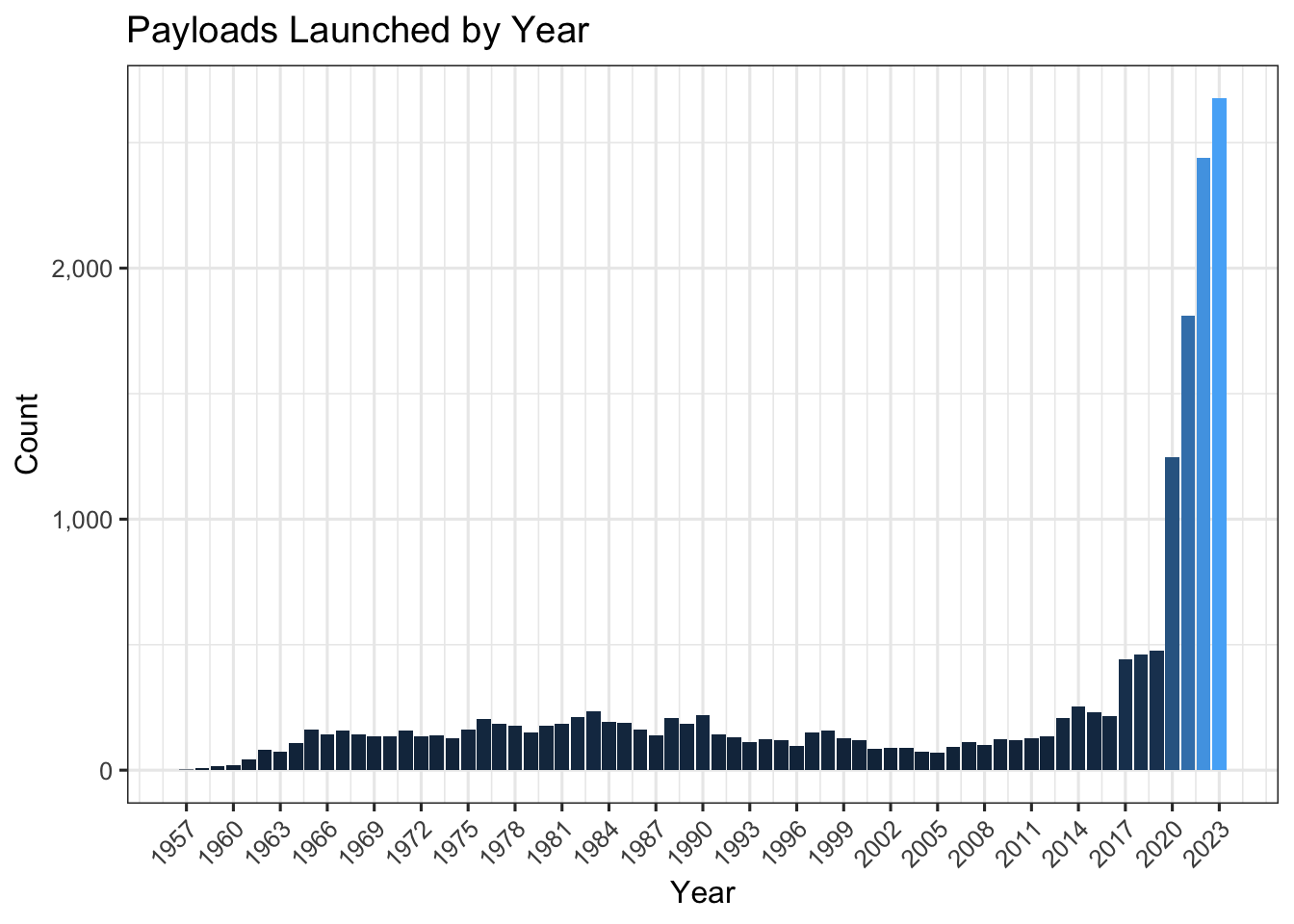
Launches and Years
How many launches per year? Looking at the chart below, recent years have dwarfed the earlier decades.
leo %>%
  filter(OBJECT_TYPE == "Payload") %>%
  ggplot(aes(x=year, fill = ..count..)) +
  geom_bar( stat = "count", show.legend = FALSE) +
  labs(title = "Payloads Launched by Year", y = "Count", x = "Year") +
  scale_y_continuous(labels = comma) +
  scale_x_continuous(breaks =  seq( min(leo$year, na.rm = T), max(leo$year, na.rm = T), by = 3) )
## Warning: The dot-dot notation (`..count..`) was deprecated in ggplot2 3.4.0.
## ℹ Please use `after_stat(count)` instead.
## This warning is displayed once every 8 hours.
## Call `lifecycle::last_lifecycle_warnings()` to see where this warning was
## generated.
#  transition_time(year) +
#  shadow_mark()

#animate(p, end_pause = 30)
Who’s launching?
Let’s look at who’s launching, but first a quick summary of the payload counts by owner. This includes payloads that may have decayed over time.
Looks like the United States is a dominant space explorer.
top_10_own <-
 leo %>%
  filter(OBJECT_TYPE == "Payload") %>%
  count(own) %>%
  top_n(10, n) %>%
  pull(own) %>%
  as.character()


leo %>%
  filter(OBJECT_TYPE == "Payload") %>%
  count(own) %>%
  top_n(10, n) %>%

  ggplot(aes(x = reorder(own, n), y = n)) +
  geom_bar( aes(fill = own), stat = "identity", show.legend = FALSE) +
  labs(title = "Top 10 owners", y = "Count of objects", x = "Owner") +
  scale_fill_viridis(discrete = TRUE) +
  coord_flip()
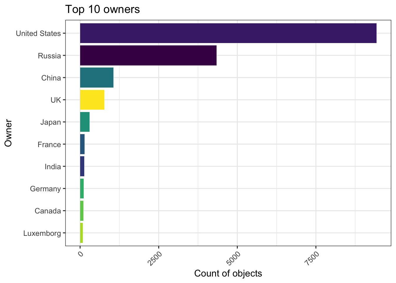
Nothing surprising here, we know that the US and Russia have been in the space race for a long time and the top 10 list above shows those - but it would be great to see which other countries have also launched.
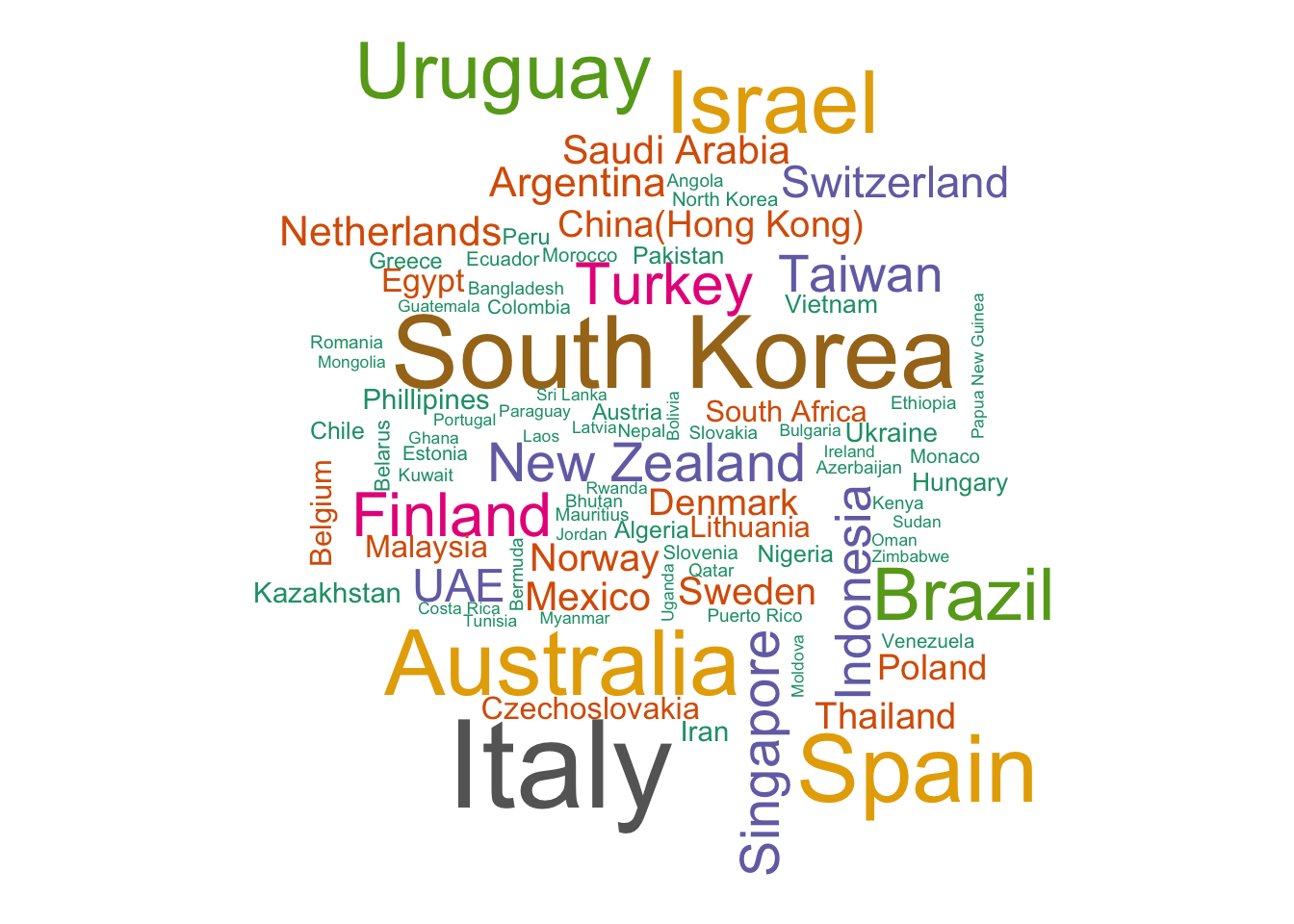
The word-cloud below shows the other countries that have launched objects - the font size of the word has a relationship with the number of objects.
Amazing to see the breadth of countries that have started to utilize space for all kinds of uses, even Papua New Guinea and Bhutan have satellites in space.
wc <- dplyr::inner_join(x = leo %>% filter(OBJECT_TYPE == "Payload"), y =  org %>% filter(Type == "CY") %>% distinct(StateCode, .keep_all = TRUE), by = c("StateCopy" = "StateCode") ) %>%
  count(ShortEName.y, name = "freq", sort = TRUE) %>%
  tail(-10)

  wordcloud(words = wc$ShortEName.y, freq = as.numeric(wc$freq), colors=brewer.pal(10, "Dark2"), min.freq = 1)
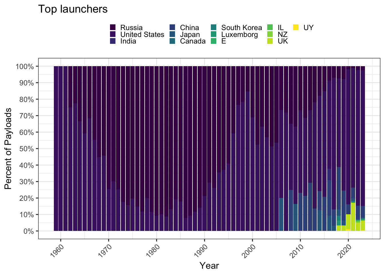
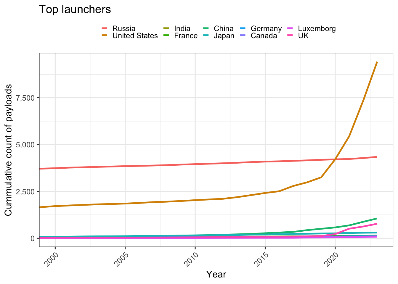
Launches by Year and Owner
Who are launching in which years. We’ll only look at the most prolific launchers per year, those with over 10 objects launched in a year. It seems that Russia was strong but has been overtaken by the US and China over time.
These countries may be providing launch services for other nations or companies.
leo %>%
  filter(OBJECT_TYPE == "Payload") %>%
  count(year, own) %>%
  filter( n> 10) %>%

  ggplot(aes(x = year, y = n)) +
  geom_col(aes(fill = own), position = "fill") +
  scale_y_continuous(labels = scales::percent, breaks = seq(0,1, by = .1)) +
  labs(title = "Top launchers", y = "Percent of Payloads", x = "Year", fill = NULL) +
  scale_fill_viridis(discrete = TRUE) +
  scale_x_continuous(breaks = scales::breaks_pretty(10))
leo %>%
  filter(OBJECT_TYPE == "Payload", own %in% top_10_own ) %>%
  count(year, own) %>%
  group_by(own) %>%
  mutate(cum_net = cumsum((n)) ) %>%

  ggplot(aes(x = year, y = cum_net)) +
  geom_line(aes(color = own), size = 1) +
  #scale_y_continuous(labels = scales::percent, breaks = seq(0,1, by = .1)) +
  labs(title = "Top launchers", y = "Cummulative count of payloads", x = "Year", color = NULL) +
  scale_y_continuous(labels = comma) +
  coord_cartesian(xlim = c(2000, NA))
Owner entity
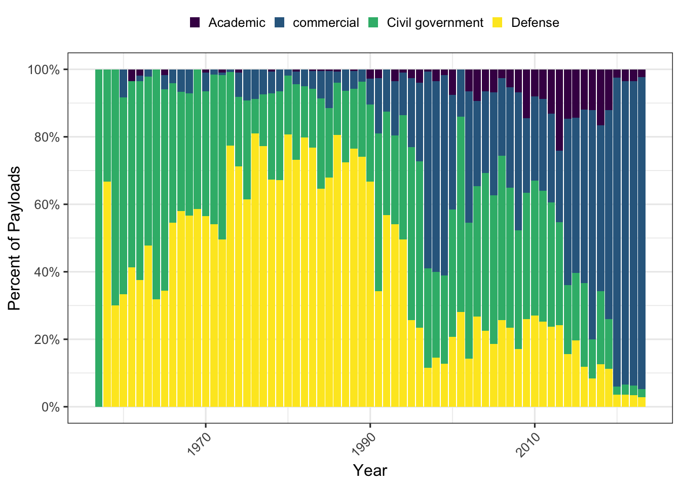
Another way to look at this picture is to see which entities are getting into space. It used to be the case that launching satellites was the domain of superpowers and each launch was highly anticipated and celebrated, slowly the technology and know-how is spreading to smaller countries and commercial entities. Space is a resource for all of us and being able to utilize it well and collaboratively is a global goal.
As you can see the number of commercial launches has dwarfed all other types of users in recent years and given what we understand from SpaceX and similar entities, that number is only going to increase.
leo %>%
  filter(OBJECT_TYPE == "Payload", Class != "NA") %>%
  count(year, Class) %>%


  ggplot(aes(x = year, y = n)) +
  geom_col(aes(fill = Class), position = "fill") +
  scale_y_continuous(labels = scales::percent, breaks = seq(0,1, by = .2)) +
  labs(y = "Percent of Payloads", x = "Year", fill = NULL) +
  scale_fill_viridis(discrete = TRUE)
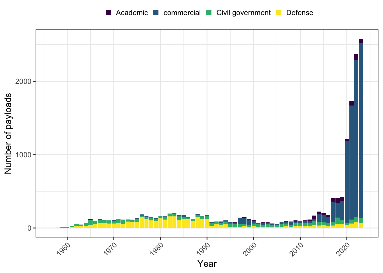
 ## The actual numbers.
leo %>%
  filter(OBJECT_TYPE == "Payload", Class != "NA") %>%
  count(year, Class) %>%

  ggplot(aes(x = year, y = n)) +
  geom_col(aes(fill = Class), position = "stack") +
  labs(y = "Number of payloads", x = "Year", fill = NULL) +
  scale_fill_viridis(discrete = TRUE) +
  scale_x_continuous(breaks = scales::breaks_pretty(10))
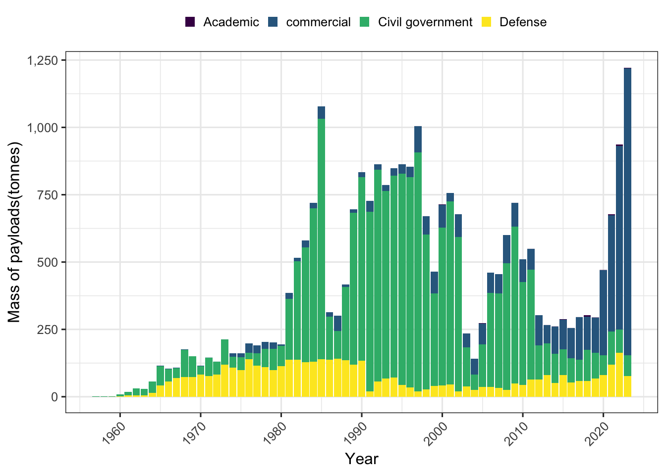
What does all this weigh?
A different view for this is by the actual kilograms of mass being sent up. Jonathan’s data has mass for each of the payloads.
That’s a lot of tonnage we’ve launched.
leo %>%
  filter(OBJECT_TYPE == "Payload", Class != "NA") %>%
  group_by(year, Class) %>%
  summarise(mass = sum(Mass), .groups = "drop") %>%

  ggplot(aes(x = year, y = mass/1000)) +
  geom_col(aes(fill = Class), position = "stack") +
  labs(y = "Mass of payloads(tonnes)", x = "Year", fill = NULL) +
  scale_y_continuous(labels = comma) +
  scale_fill_viridis(discrete = TRUE) +
  scale_x_continuous(breaks = scales::breaks_pretty(10))
Currently active objects
Over time, some of the older objects and debris tend to decay and fall into the atmosphere and burn up. Some even land in oceans, or worse, on land.
Let’s try to explore this facet. One interesting thing to note is that it takes fewer launches (rocket bodies) to launch many satellites, presumably many objects are being launched in shared missions.
evolution <- leo %>%
  filter(OBJECT_TYPE != "Unknown") %>%
  group_by(separation_year, OBJECT_TYPE) %>%
  arrange(SEPARATION_DATE, .by_group = TRUE) %>%
  summarise(added = n(),
  decayed = sum(in_orbit == 0)
  ,.groups = "drop") %>%
  group_by(OBJECT_TYPE) %>%
  mutate(cum_net = cumsum(added - decayed)) %>%
  ungroup()

  ggplot(data = evolution, aes(x=separation_year)) +
  geom_line(aes(y=added, color = "Added")) +
  geom_line(aes(y=decayed, color = "Decayed")) +
  facet_wrap(vars(OBJECT_TYPE), scales = "free_y") +
  labs(title = "Objects added and decayed", x = '', y = "Count of Objects", color = "") +
  scale_y_continuous(labels = comma) +
  scale_color_brewer(palette = "Set1")
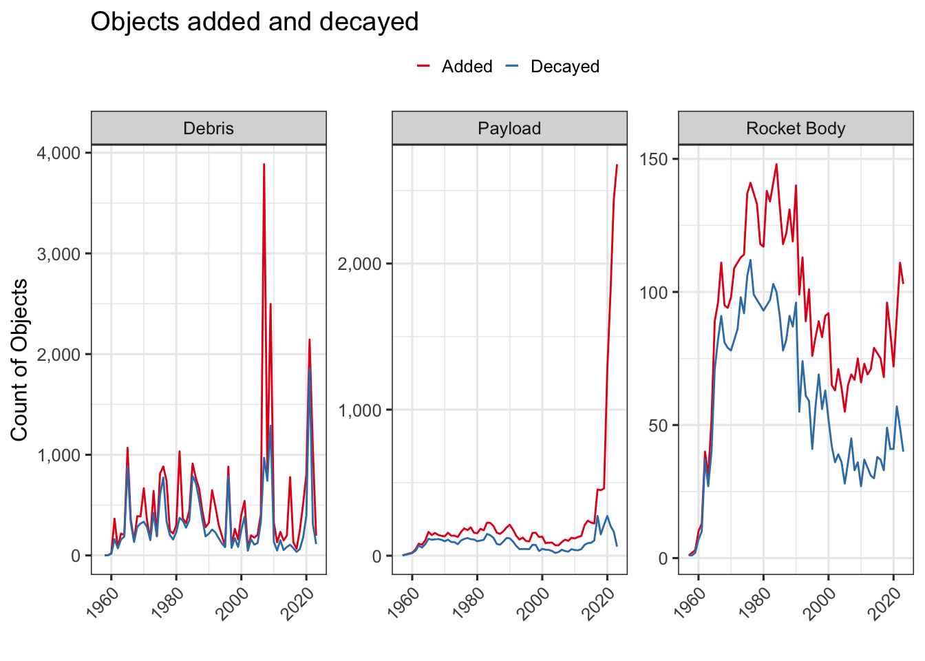
Evolution over time.
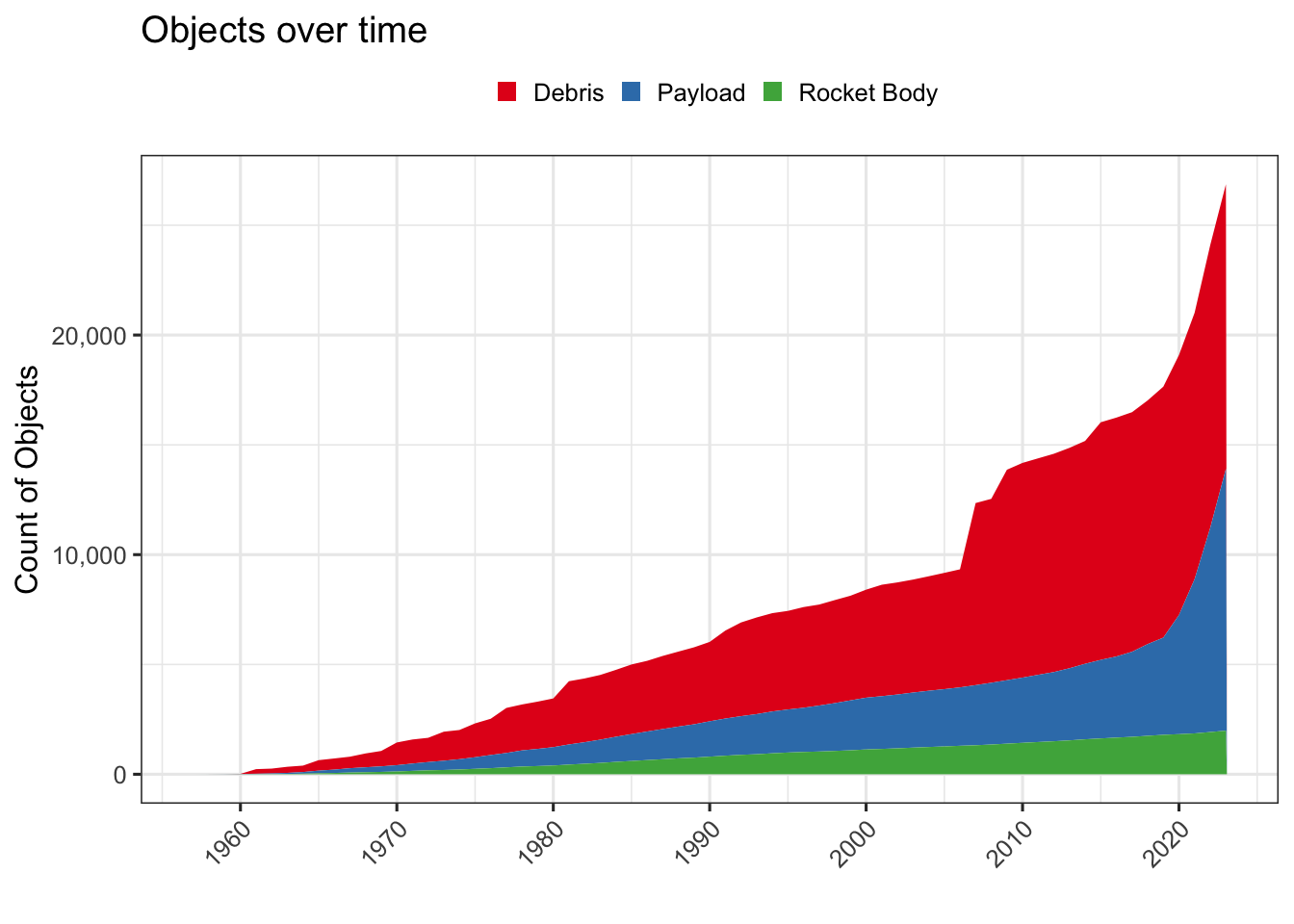
How many objects, net of any decayed ones, are in space today.
Wow, that’s a lot of junk up there. We’ll dig into this a bit more.
ggplot(data = evolution, aes(x=separation_year)) +
  geom_area(aes(y=cum_net , fill = OBJECT_TYPE), position = "stack") +
  labs(title = "Objects over time", x = '', y = "Count of Objects", fill = "") +
  scale_y_continuous(labels = comma) +
  theme(legend.key.size = unit(0.3, 'cm')) +
  scale_fill_brewer(palette = "Set1") +
  scale_x_continuous(breaks = scales::breaks_pretty(10))
Commercialization of Space.
Over the last few years, we have seen larger and larger numbers of satellites being launched into space by commercial entities. Let’s take a look at what’s going on there.
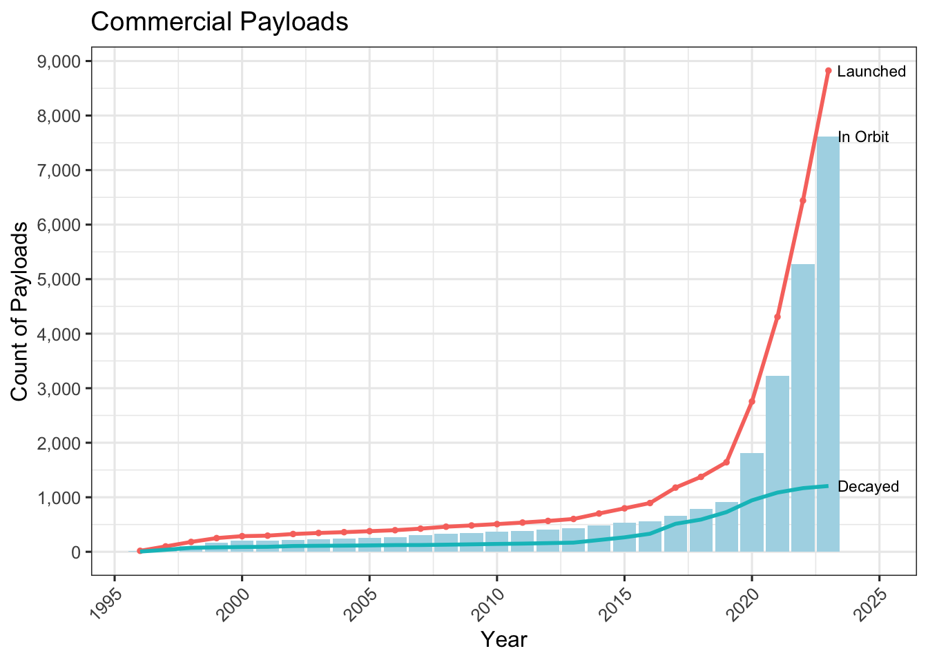
Commercial Payloads.
We see quite a big jump in the recent few years. While there was some commercial activity early on, the industry started coming into its own only after 1995
leo %>%
  filter(Class == "commercial", OBJECT_TYPE == "Payload", separation_year > 1995, )  %>%
  group_by(separation_year) %>%
  arrange(SEPARATION_DATE, .by_group = TRUE) %>%
  summarise(added = n(),
  decayed = sum(in_orbit == 0)
  ,.groups = "drop") %>%
  ungroup() %>%

  mutate(cum_net = cumsum(added - decayed), cum_added = cumsum(added), cum_decayed = cumsum(decayed)) %>%
  ungroup() %>%

  ggplot(aes(x=separation_year)) +
  geom_col(aes(y=cum_net, ), fill = "lightblue", size = 1, show.legend = F) +
  geom_line(aes(y=cum_added, color = "added"), size = 1, show.legend = F) +
  geom_point(aes(y=cum_added, color = "added"), size = 1, show.legend = F) +
  geom_line(aes(y=cum_decayed, color = "decayed"), size = 1, show.legend = F) +

  labs(title = "Commercial Payloads", x = 'Year', y = "Count of Payloads", fill = "")  +
  geom_text_repel( data = (. %>% drop_na() %>% filter(separation_year == max(separation_year)) %>% slice_tail() ),  aes(label = "Launched", x = separation_year, y = cum_added, ), hjust = 1, nudge_x = 2, direction = "x", size = 3, segment.color =  "grey", show.legend = F) +
  geom_text_repel( data = (. %>% drop_na() %>% filter(separation_year == max(separation_year)) %>% slice_tail() ),  aes(label = "Decayed", x = separation_year, y = cum_decayed, ), hjust = 1, nudge_x = 2, direction = "x", size = 3, segment.color =  "grey", show.legend = F) +
  geom_text_repel( data = (. %>% drop_na() %>% filter(separation_year == max(separation_year)) %>% slice_tail() ),  aes(label = "In Orbit", x = separation_year, y = cum_net, ), hjust = 1, nudge_x = 2, direction = "x", size = 3, segment.color =  "grey", show.legend = F) +

  scale_x_continuous(breaks = scales::breaks_pretty(10)) +
  scale_y_continuous(breaks = scales::breaks_pretty(8), labels = comma)
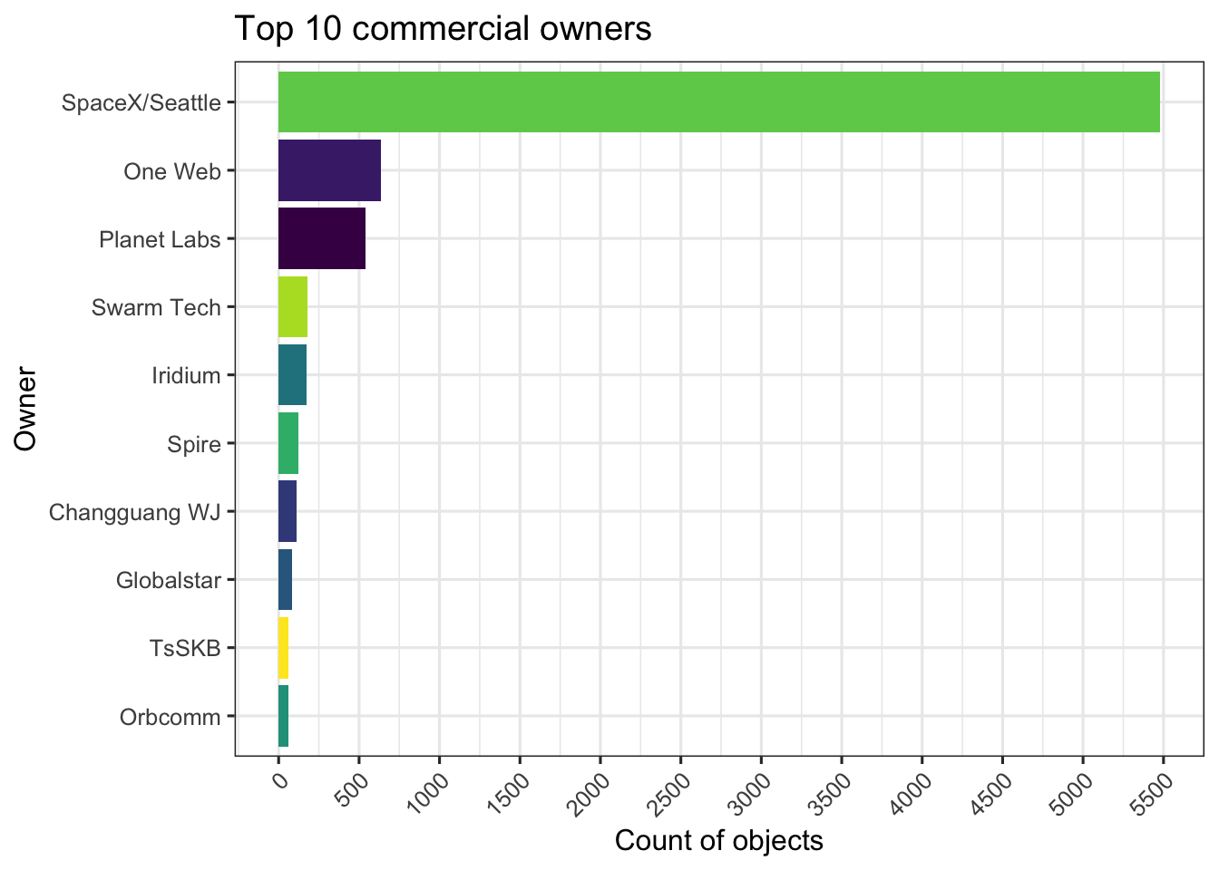
Who is Launching?
Let’s dig into the companies that are most active.
Clearly SpaceX is by far in a huge lead over the others. This race is obviously just starting up and we will see these numbers evovle over time.
leo %>%
  filter(Class == "commercial", OBJECT_TYPE == "Payload",)  %>%
  count(ShortName) %>%
  top_n(10, n) %>%

  ggplot(aes(x = reorder(ShortName, n), y = n)) +
  geom_bar( aes(fill = ShortName), stat = "identity", show.legend = FALSE) +
  labs(title = "Top 10 commercial owners", y = "Count of objects", x = "Owner") +
  scale_fill_viridis(discrete = TRUE) +
  coord_flip() +
  scale_y_continuous( breaks = scales::breaks_pretty(20))
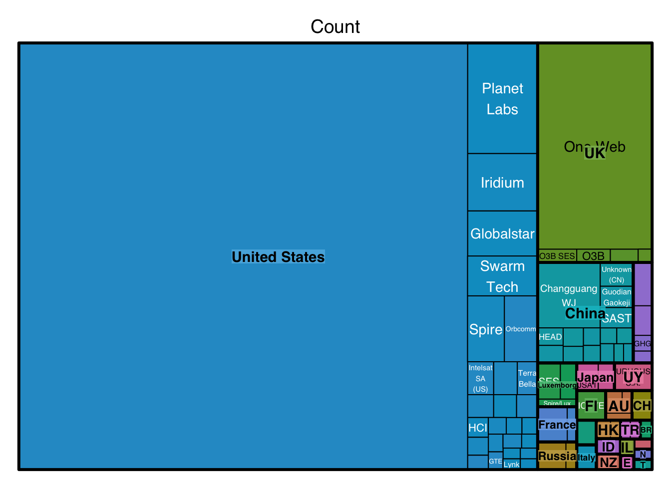
All commercial Operators
This view shows a map of all the operators that have at least five object in orbit.
leo %>%
  filter(Class == "commercial", OBJECT_TYPE == "Payload",  in_orbit == 1)  %>%
  mutate(country = as.character(own), company = as.character(ShortName)) %>%
  count(country, company, name = "Count") %>%
  filter(Count > 4) %>%

    treemap(index = c("country", "company"), vSize = "Count", vColor = "country")
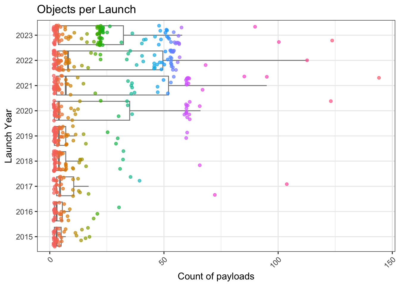
How fast are we launching?
In recent years folks have started launching multiple payloads from single launch vehicles. Let’s look at what kind of numbers we are seeing in the recent years. This chart shows higher number of payloads in more recent years - for launches that had more than one payload. The box and whisker plots show the quantiles of the count of objects per launch vehicle.
leo %>%
  filter(OBJECT_TYPE == "Payload", separation_year > 2014) %>%
  count(separation_year, LAUNCH_DATE) %>%
  filter(n > 1) %>%

  ggplot(aes(x=as.factor(separation_year), y = n)) +
  #ggridges::geom_density_ridges(aes(x = n, y = as.character(separation_year), fill = separation_year), rel_min_height = 0.001, scale = 1.5, show.legend = FALSE, quantile_lines = TRUE)
  #geom_violin(color = "gray") +
  geom_boxplot(color = "gray50", outlier.size = -1) +
  geom_point( position = "jitter", alpha = 0.7, aes(color=as.factor(n))) +
  guides(color=FALSE) +
  labs(title = "Objects per Launch", x = "Launch Year", y = "Count of payloads") +
  coord_flip()
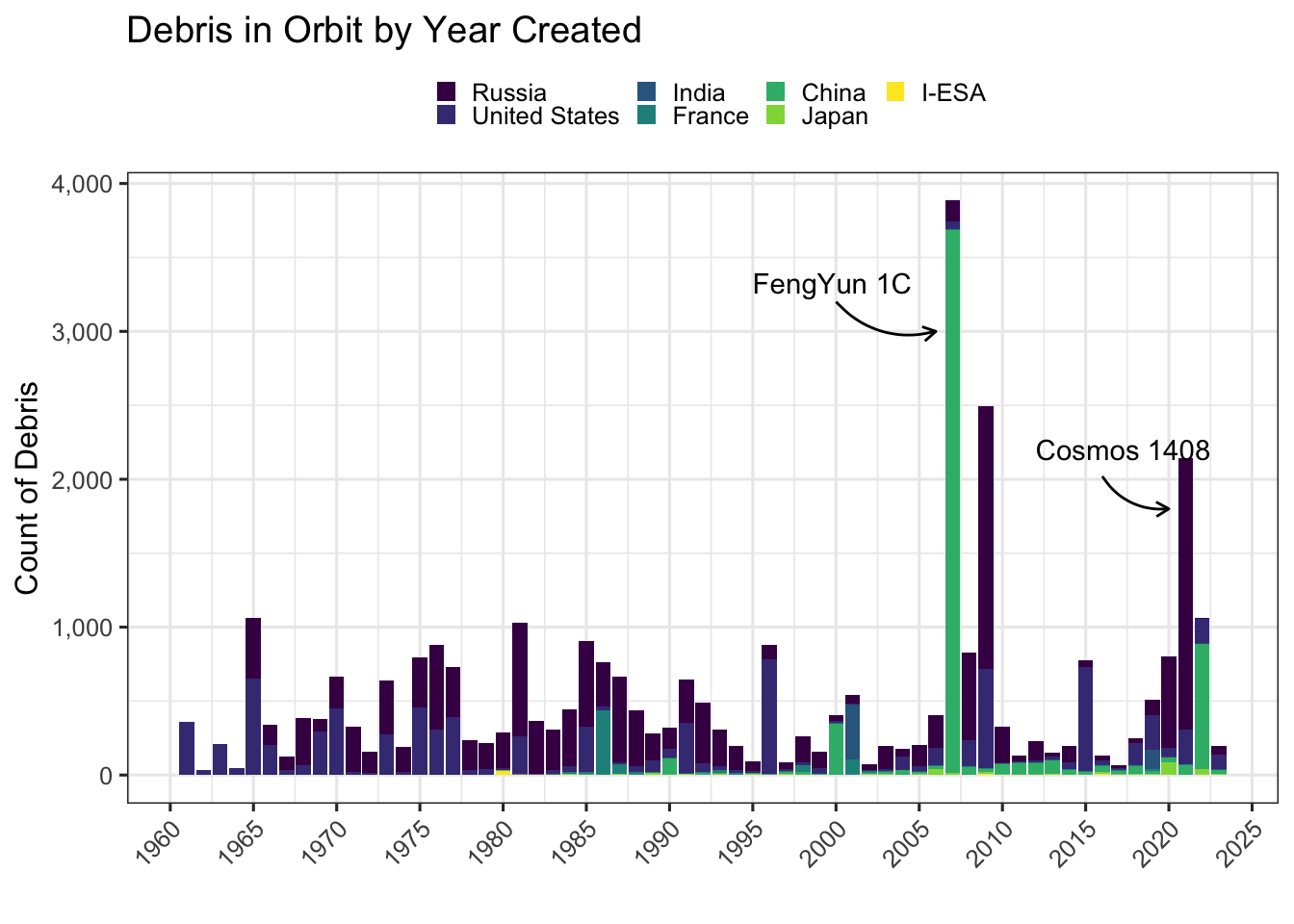
Debris - who is producing the junk?
Debris in space is a large and growing problem for low earth orbits and if we don’t get this problem under control, we’ll lose the opportunity to grow past our planet.
Let’s look at the debris that are still orbiting and when these were added to their orbits. We’ll also try to see which orbits these exist in.
evolution_owner <- leo %>%
  filter(OBJECT_TYPE != "Unknown") %>%
  group_by(separation_year, OBJECT_TYPE, own) %>%
  arrange(SEPARATION_DATE, .by_group = TRUE) %>%
  summarise(added = n(),
  decayed = sum(in_orbit == 0),
  .groups = "keep") %>%
  ungroup() %>%
  group_by(OBJECT_TYPE, own) %>%
  mutate(cum_net = cumsum(added - decayed)) %>%
  filter(cum_net >= 20) %>%
  ungroup()

ggplot(data = evolution_owner %>% filter(OBJECT_TYPE == "Debris", ), aes(x=separation_year)) +
  geom_col(aes(y=added , fill = own), group = "own", stat="identity", position = "stack") +
  labs(title = "Debris in Orbit by Year Created", x = '', y = "Count of Debris", fill = "") +

  scale_y_continuous(labels = comma) +
  scale_x_continuous(breaks = scales::breaks_pretty(10)) +
  theme(legend.key.size = unit(0.3, 'cm')) +
  scale_fill_viridis(discrete = T) +
  annotate(
    geom = "curve", x = 2000, y = 3200, xend = 2006, yend = 3000,
    curvature = .3, arrow = arrow(length = unit(2, "mm"))
  ) +
  annotate(geom = "text", x = 1995, y = 3330, label = "FengYun 1C", hjust = "left") +

  annotate(
    geom = "curve", x = 2016, y = 2020, xend = 2020, yend = 1800,
    curvature = .3, arrow = arrow(length = unit(2, "mm"))
  ) +
  annotate(geom = "text", x = 2012, y = 2200, label = "Cosmos 1408", hjust = "left")
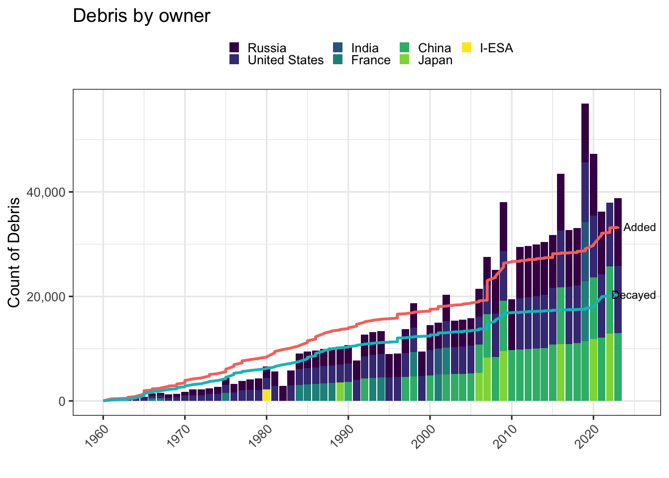
Debris - What are the totals?
We can see how many bad things are up there. These are debris that can be tracked by the currently available radars and telescopes. The estimates for smaller, non-trackable debris is still much higher.
leo %>%
  filter(OBJECT_TYPE %in% c("Debris"), !is.na(separation_year) ) %>%
  group_by(separation_year, own) %>%
  arrange(SEPARATION_DATE, .by_group = TRUE) %>%
  summarise(added = n(),
  decayed = sum(in_orbit == 0, na.rm = TRUE)
  , .groups = "drop" ) %>%
  mutate(cum_added = cumsum(added), cum_decayed = cumsum(decayed), cum_net = cumsum(added - decayed)) %>%
  filter(added >=10) %>%
  ungroup() %>%

  ggplot(aes(x=separation_year)) +
  geom_col(aes(y=cum_net , fill = own), group = "own", position = "stack") +
  geom_line(aes(y=cum_added, color = "added"), size = 1, show.legend = F) +
  geom_line(aes(y=cum_decayed, color = "decayed"), size = 1, show.legend = F) +
  labs(title = "Debris by owner", x = '', y = "Count of Debris", fill = "") +

  geom_text_repel( data = (. %>% drop_na() %>% filter(separation_year == max(separation_year)) %>% slice_tail() ),  aes(label = "Added", x = separation_year, y = cum_added, ), hjust = 0, nudge_x = 2, direction = "x", size = 3, segment.color =  "grey", show.legend = F) +
  geom_text_repel( data = (. %>% drop_na() %>% filter(separation_year == max(separation_year)) %>% slice_tail() ),  aes(label = "Decayed", x = separation_year, y = cum_decayed, ), hjust = 0, nudge_x = 2, direction = "x", size = 3, segment.color =  "grey", show.legend = F) +
  scale_y_continuous(labels = comma) +
  scale_fill_viridis(discrete = T) +
  scale_x_continuous(breaks = scales::breaks_pretty(10))
Most objects orbit the earth in elliptical orbits, which means that they usually have high and low points in their orbits. Let’s try to understand which part of space is more crowded.
Looking at the most crowded parts of space, roughly speaking this is what each of the levels mean. We’ll focus on the two most popular spots in orbit; GEO or Geostationary orbits - such objects have an orbital period equal to earth’s rotational period, so roughly 24 hours. The result is that these object tend to appear fixed in the sky. The LEO or Low earth orbits extend from 80 to 2000 km
| Orbit | Height (km) |
|---|---|
| GEO Geostationary orbit | 35,786 |
| LEO Low earth orbit | 80 - 2,000 |
  leo %>%
  filter(Orbit %in% c("LEO", "GEO", "HEO" )) %>%
  ggplot() +
  geom_density_2d(aes(x=Apogee, y = Perigee), na.rm = T, contour_var = "ndensity") +
  scale_y_continuous(labels = comma) +
  scale_x_continuous(labels = comma) +
  labs(x = "Apogee (km)", y = "Perigee (Km)") +
  facet_wrap(vars(Orbit), scales = "free")
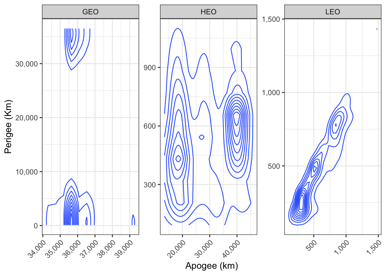
Let’s dig into this.
As we can see the most variation is in the Low earth orbits - we will spend some time here and dig into this a bit more.
How long do these objects survive in space.
Let’s see what kind of objects have longer lives in space.
leo %>%
  filter(in_orbit_years >= 0, OBJECT_TYPE != "Unknown")  %>%
  ggplot() +
  geom_histogram(aes(((in_orbit_years)), fill = OBJECT_TYPE), position = "stack", bins = 10) +
  labs(title = "Time in Orbit", x = 'Years in Orbit', y = "Count of Objects", fill = "") +
  theme(legend.key.size = unit(0.3, 'cm')) +
  scale_fill_viridis(discrete = T) +
  scale_x_continuous(breaks = scales::breaks_pretty(10)) +
  scale_y_continuous( labels = comma)
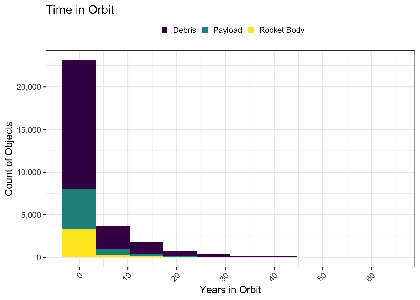
While a lot of objects spend short time in orbit there are many more that take much longer to decay and fall out of orbits.
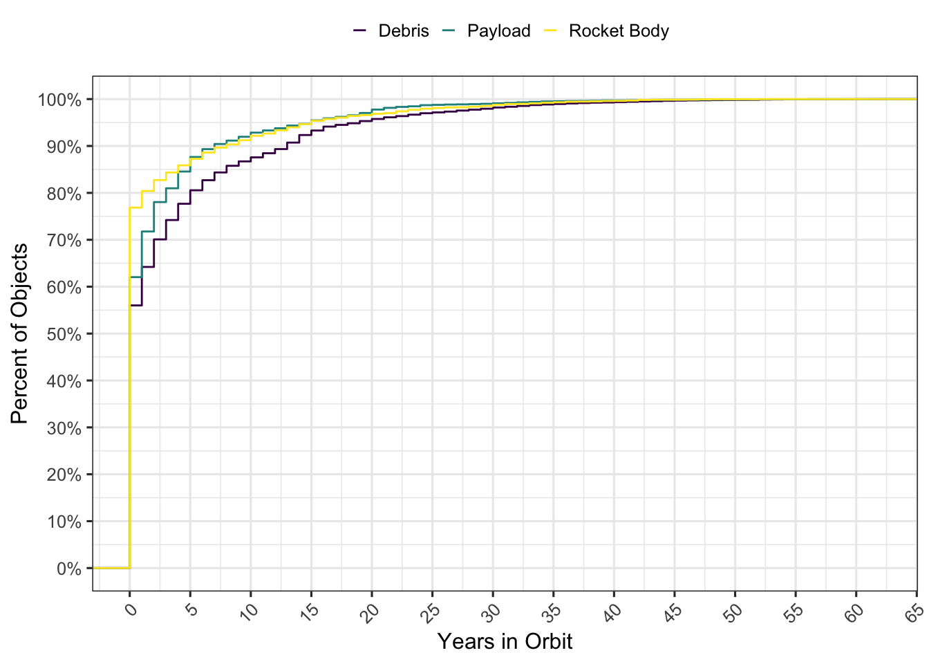
Let’s see what that distribution looks like. This shows that about 60% of the debris decay in a year but the rest last much longer. In fact it’s predicted that some of the debris will stay in orbit for centuries.
leo %>%
  filter(in_orbit_years >= 0, OBJECT_TYPE != "Unknown")  %>%
  ggplot() +
  stat_ecdf(aes(x=in_orbit_years, group=OBJECT_TYPE, color = OBJECT_TYPE)) +
  labs( x = 'Years in Orbit', y = "Percent of Objects", color = "") +
  scale_y_continuous(labels = scales::percent, breaks = seq(0,1, by = .1)) +
  theme(legend.key.size = unit(0.3, 'cm')) +
  scale_color_viridis(discrete = T) +
  scale_x_continuous(breaks = scales::breaks_pretty(10))
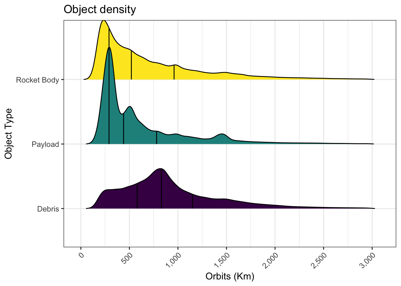
Let’s take a look at the distribution of debris and actual payloads and where those exist.
This plot shows the bad neighborhoods, most rocket bodies are clustered in lower orbits (median at 450 kms) but debris are spread pretty much everywhere.
leo %>%
  filter(Orbit %in% c("LEO"), OBJECT_TYPE != "Unknown") %>%
  ggplot() +
  #geom_density(aes(Apogee, fill = OBJECT_TYPE), na.rm = T, alpha = 0.7) +
  ggridges::geom_density_ridges(aes(x = Apogee, y = OBJECT_TYPE, fill = OBJECT_TYPE), rel_min_height = 0.001, scale = 1.5, show.legend = FALSE, quantile_lines = TRUE) +
  labs(title = "Object density", y = "Object Type", x = "Apogee (Km)") +
  scale_x_continuous(labels = comma, breaks = scales::breaks_pretty(10)) +
  scale_fill_viridis(discrete = T)
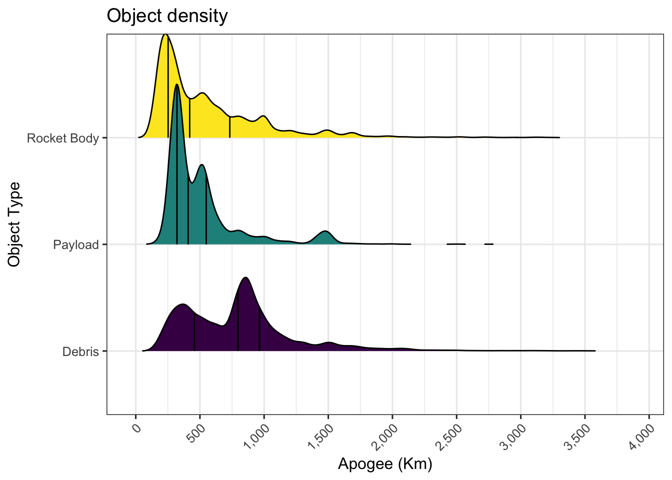
There is a glaring issue with this chart above, we are only looking at the Apogee here. The objects typically have elliptical orbits so we should check all orbital planes that the object passes through as it moves from the apogee to the perigee. One way to do this would be to proportionally assign parts to each 10 km orbital plane the object passes through.
This would work for most orbits except for HEO (Highly Elliptical Orbits), those are designed to increase dwell times over certain parts. We’ll ignore both the HEO and GEO for now.
Compared with the chart above, it’s clear that the low earth orbits are quite filled up with all kinds of things floating around.
Both charts show an odd bump in the number of Payloads near 1450 km, we will try and dig into that later.
orbits <- leo %>%
  filter(Perigee_rnd < Inf, Apogee_rnd < Inf, Perigee_rnd > 0, Apogee_rnd > 0, Orbit %in% c("LEO" )) %>%
  rowwise() %>%
  mutate(orbital_planes = list(seq(Perigee_rnd, Apogee_rnd, length.out= abs(Apogee_rnd - Perigee_rnd)/10 +1))) %>%
  unnest(orbital_planes) %>%
  select(JCAT, orbital_planes, OBJECT_TYPE, Parent, Name, separation_year, in_orbit) %>%
  add_count(Parent, name = "debris_count", sort = T) %>%
  left_join(leo, by = c("Parent" = "JCAT"), na_matches = "never")


orbits %>% filter(orbital_planes < 3000, OBJECT_TYPE.x != 'Unknown') %>%
  ggplot() +

  ggridges::geom_density_ridges(aes(x = orbital_planes, y = OBJECT_TYPE.x, fill = OBJECT_TYPE.x), rel_min_height = 0.001, scale = 1.5, show.legend = FALSE, quantile_lines = TRUE) +
  labs(title = "Object density", y = "Object Type", x = "Orbits (Km)") +
  scale_x_continuous(labels = comma, breaks = scales::breaks_pretty(10)) +

  theme(legend.key.size = unit(0.3, 'cm')) +
  scale_fill_viridis(discrete = T)
## Picking joint bandwidth of 34.1
Worst Neighborhoods
Where are the worst debris in space and what kind
orbits %>%
  filter(OBJECT_TYPE.x !=  "Unknown" ) %>%
  count(orbital_planes, OBJECT_TYPE.x) %>%

  ggplot() +
    geom_raster(aes(y = orbital_planes, x = OBJECT_TYPE.x, fill = n)) +
    scale_fill_gradient(high = "#FF007F", low = "#000033") +

    labs(title = "Density ", y = "Altitude bins (Kms)", x = "") +
    theme(legend.key.size = unit(0.3, 'cm'), legend.direction = "vertical", legend.position = "right") +
    guides(fill = guide_legend(title="Count"))
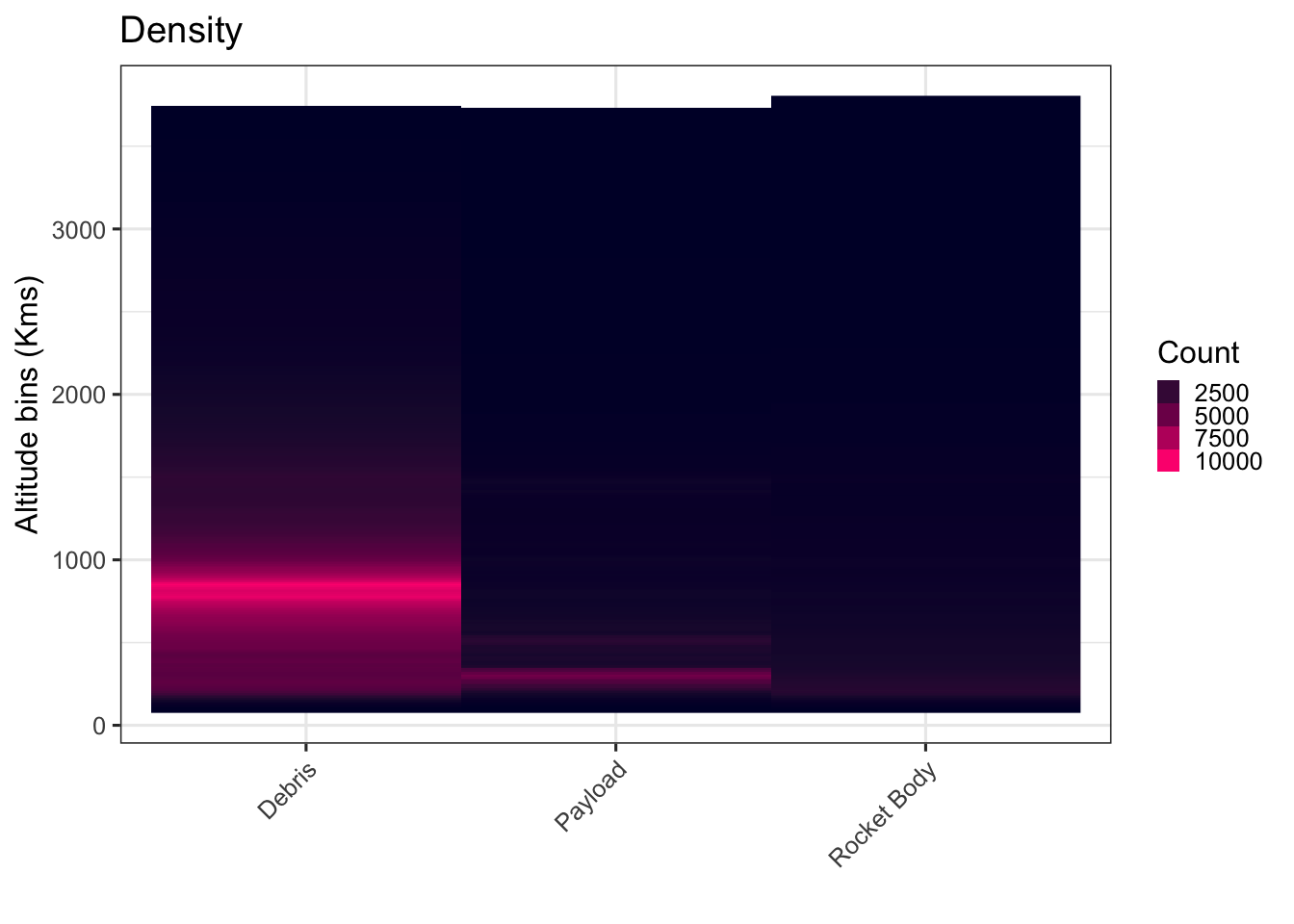
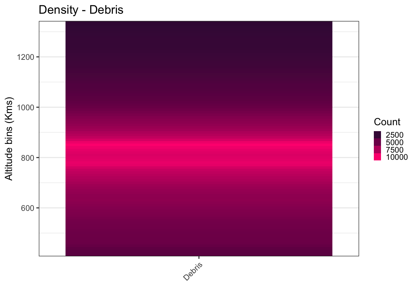
As you can see - the density of debris is highest between 500 and 1500 Km. Let’s just focus on this region to see how bad it really looks by drilling into this area of space.
orbits %>%
  filter(OBJECT_TYPE.x ==  "Debris" ) %>%
  count(orbital_planes, OBJECT_TYPE.x) %>%

  ggplot() +
    geom_raster(aes(y = orbital_planes, x = OBJECT_TYPE.x, fill = n)) +
    scale_fill_gradient(high = "#FF007F", low = "#000033") +
    labs(title = "Density - Debris ", y = "Altitude bins (Kms)", x = "") +
    theme(legend.key.size = unit(0.3, 'cm'), legend.direction = "vertical", legend.position = "right") +
    guides(fill = guide_legend(title="Count")) +
  coord_cartesian(ylim = c(450, 1300))
More on Debris
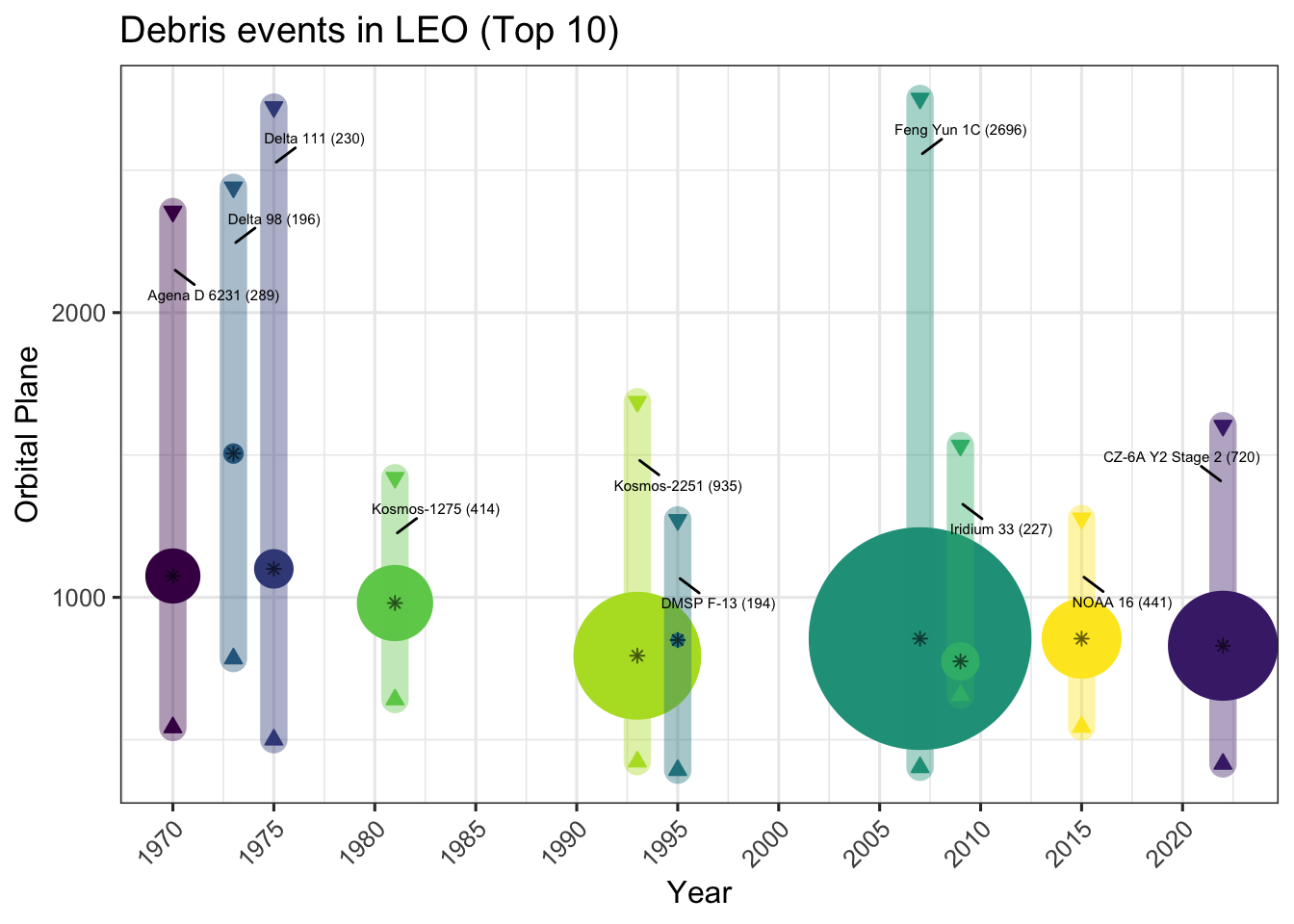
Let’s identify some of the big sources of debris. In most cases these are results of different kinds of anti-satellite (ASAT) weapons testing. Some of these are co-orbital and others are direct ascent.
Co-orbital weapons are placed in orbit and maneuver close to their targets and attack it by various means, including direct collision, fragmentation or using robotic arms. Fragmentation techniques, of course, produce additional debris around their intended targets.
Direct ascent weapons are missiles launched from earth to intercept and destroy a target satellite.
The chart below shows the debris spread between the highest plane and lowest planes. The numbers in the brackets show the currently tracked number of debris in orbit from each. Each of these events has likely produced a large number of debris that are too small to be tracked but are nonetheless lethal if they hit something.
# Find the min perigee and max apogee for each debris event

leo %>%
  filter(Perigee_rnd < Inf, Apogee_rnd < Inf, Perigee_rnd > 0, Apogee_rnd > 0, Orbit %in% c("LEO" ), in_orbit == TRUE) %>%
  group_by(Parent) %>%
  summarise(min = min(Perigee, na.rm = TRUE),
            max = max(Apogee, na.rm = TRUE),
            debris_count = n(),
            separation_year = min(separation_year)) %>%
  ungroup() %>%
  arrange(desc(debris_count)) %>%
  inner_join(leo, by = c("Parent" = "JCAT")) %>%

  filter(Parent %in% head(unique(Parent), 10) ) %>%

  ggplot(aes(x = separation_year.x)) +
  #ggridges::geom_density_ridges(aes(x = orbital_planes, y = Name.y, fill = Parent.y), rel_min_height = 0.001, scale = 1.5, show.legend = FALSE, quantile_lines = TRUE, alpha = 1) +
  geom_point(aes( y = (Apogee_rnd + Perigee_rnd)/2, size = debris_count, color = Name), show.legend = FALSE) +
  geom_point(aes(y = (Apogee_rnd + Perigee_rnd)/2), shape = 8, show.legend = FALSE) +
  geom_point(aes(y = min, color = Name, fill = Name), size = 2, shape = 24, show.legend = FALSE) +
  geom_point(aes(y = max, color = Name, fill = Name), size = 2, shape = 25, show.legend = FALSE) +
  geom_segment(aes(xend = separation_year.x, y = min, yend = max, color = Name), size = 5, lineend = "round", alpha = 0.4, show.legend = FALSE) +
  labs(title = "Debris events in LEO (Top 10)", y = "Orbital Plane", x = "Year") +
  scale_x_continuous( breaks = scales::breaks_pretty(10)) +
  scale_size_continuous(range = c(2,40)) +

  theme(legend.key.size = unit(0.3, 'cm')) +
  scale_fill_viridis(discrete = T) +
  scale_color_viridis(discrete = T) +
  geom_text_repel( aes(y = max - 200, label = paste0(Name, " (", debris_count, ")")), size = 2, nudge_x = .15, box.padding = 0.5, )
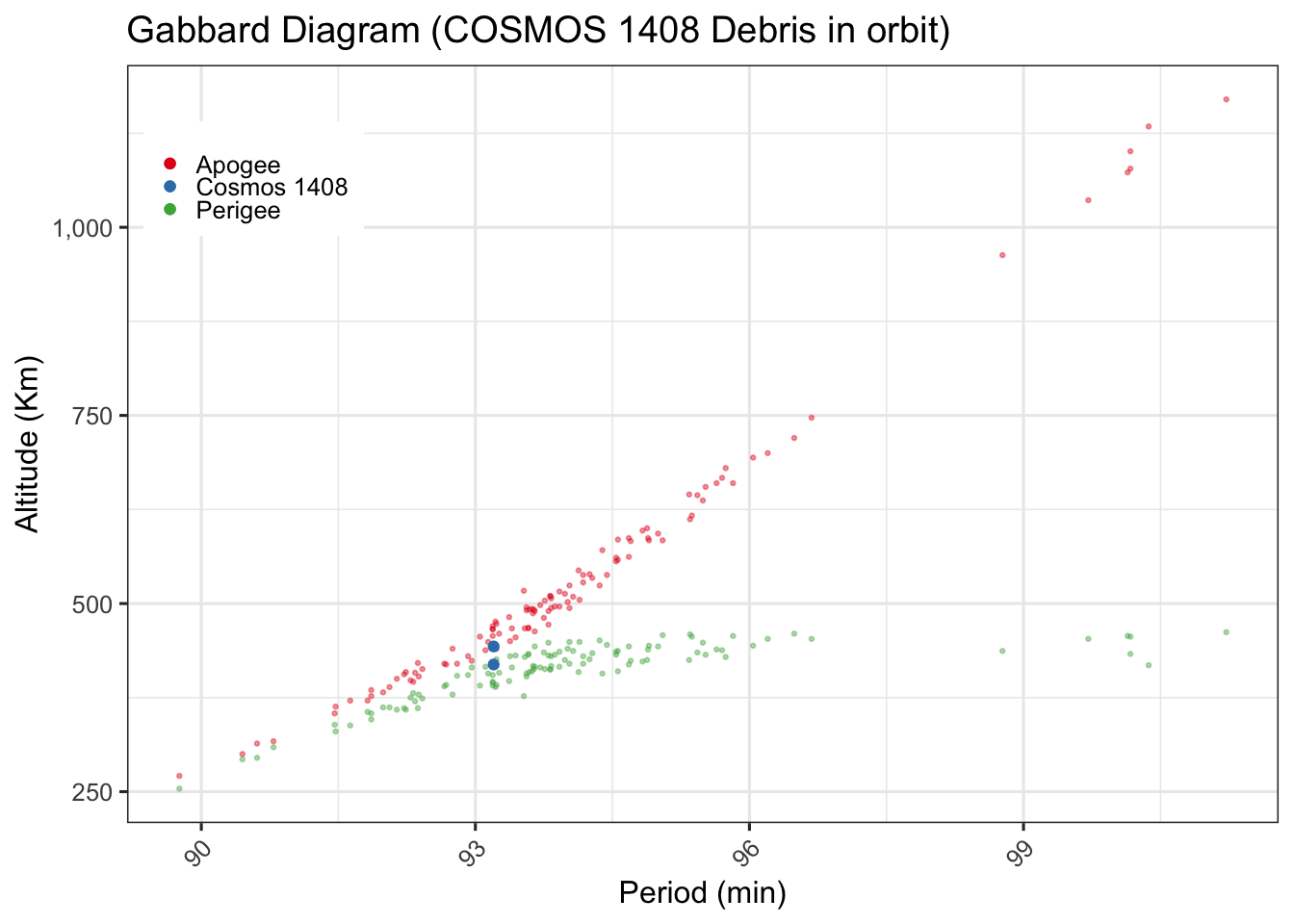
Gabbard Diagrams
These are useful to understand breakup events and we will create one such diagram for the Cosmos 1408 breakup event. Surprisingly, Jonathan’s satcat does not seem to have the period of these objects and this is an essential piece of data for this diagram. We’ll use the satcat from celestrack for this.
Cosmos 1408 This figure shows the Gabbard diagram for Cosmos 1405 as of 2023-04-16.
gbd %>%
  filter(OBJECT_NAME %in% c("COSMOS 1408", "COSMOS 1408 DEB"),  is.na(DECAY_DATE)) %>%
  ggplot(aes(x = PERIOD)) +
  geom_point(data = . %>% filter(OBJECT_NAME == "COSMOS 1408 DEB"), aes(y = APOGEE,  color = "Apogee"), alpha = 0.4, size = 0.5) +
  geom_point(data = . %>% filter(OBJECT_NAME == "COSMOS 1408 DEB"), aes(y = PERIGEE, color = "Perigee"), alpha = 0.4,size = 0.5 ) +
  geom_point(data = . %>% filter(OBJECT_NAME == "COSMOS 1408"), aes(y = APOGEE, color = "Cosmos 1408")) +
  geom_point(data = . %>% filter(OBJECT_NAME == "COSMOS 1408"), aes(y = PERIGEE, color = "Cosmos 1408") ) +

  labs(title ="Gabbard Diagram (COSMOS 1408 Debris in orbit)",  y = "Altitude (Km)", x = "Period (min)", color = NULL) +
  theme(legend.position = c(0.11, .85), legend.direction = "vertical") +
  scale_color_brewer(palette = "Set1") +
  scale_y_continuous(labels = comma)
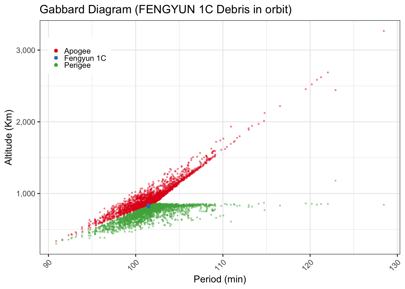
Feng Yun 1C
Let’s do one more for the Feng Yun 1C
gbd %>%
  filter(OBJECT_NAME %in% c("FENGYUN 1C", "FENGYUN 1C DEB"),  is.na(DECAY_DATE)) %>%
  ggplot(aes(x = PERIOD)) +
  geom_point(data = . %>% filter(OBJECT_NAME == "FENGYUN 1C DEB"), aes(y = APOGEE,  color = "Apogee"), alpha = 0.4, size = 0.5) +
  geom_point(data = . %>% filter(OBJECT_NAME == "FENGYUN 1C DEB"), aes(y = PERIGEE, color = "Perigee"), alpha = 0.4,size = 0.5 ) +
  geom_point(data = . %>% filter(OBJECT_NAME == "FENGYUN 1C"), aes(y = APOGEE, color = "Fengyun 1C"), ) +
  geom_point(data = . %>% filter(OBJECT_NAME == "FENGYUN 1C"), aes(y = PERIGEE, color = "Fengyun 1C"), ) +

  labs(title ="Gabbard Diagram (FENGYUN 1C Debris in orbit)",  y = "Altitude (Km)", x = "Period (min)", color = NULL) +
  theme(legend.position = c(0.11, .85), legend.direction = "vertical") +
  scale_color_brewer(palette = "Set1") +
  scale_y_continuous(labels = comma)
Payloads
We dug into debris above, now let’s turn our attention to the actual Payloads and look more at those.
Orbits
Satellite orbits have many interesting characteristics. The eccentricity, or how elliptical it is, the inclination and other aspects. We have already explored the apogee and perigee a little.
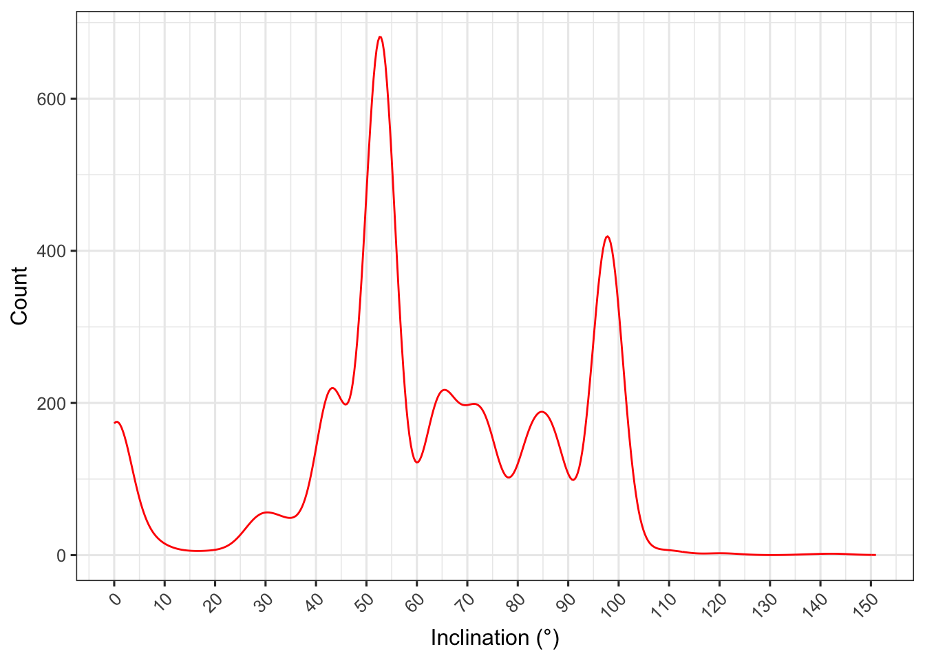
Inclination
An inclination of 30° could also be described using an angle of 150°. The convention is that the normal orbit is prograde, an orbit in the same direction as the planet rotates. Inclinations greater than 90° describe retrograde orbits (backward). Thus:
An inclination of 0° means the orbiting body has a prograde orbit in the planet’s equatorial plane. An inclination greater than 0° and less than 90° also describes a prograde orbit. An inclination of 63.4° is often called a critical inclination, when describing artificial satellites orbiting the Earth, because they have zero apogee drift.[3] An inclination of exactly 90° is a polar orbit, in which the spacecraft passes over the poles of the planet. An inclination greater than 90° and less than 180° is a retrograde orbit. An inclination of exactly 180° is a retrograde equatorial orbit. Let’s look at the inclinations of the payloads we have in our data.
We see peaks at 0°, 52°/53° and 97°/98°.
leo %>%
  filter(OBJECT_TYPE == "Payload") %>%
  mutate(Inc_rounded = round_any(Inc,1)) %>%
  #count(Inc_rounded) %>%

  ggplot() +
  geom_density(aes(x=Inc_rounded, after_stat(count)),color = "red") +
  labs(y = "Count", x = "Inclination (°)") +
  scale_x_continuous(breaks = scales::breaks_pretty(20))
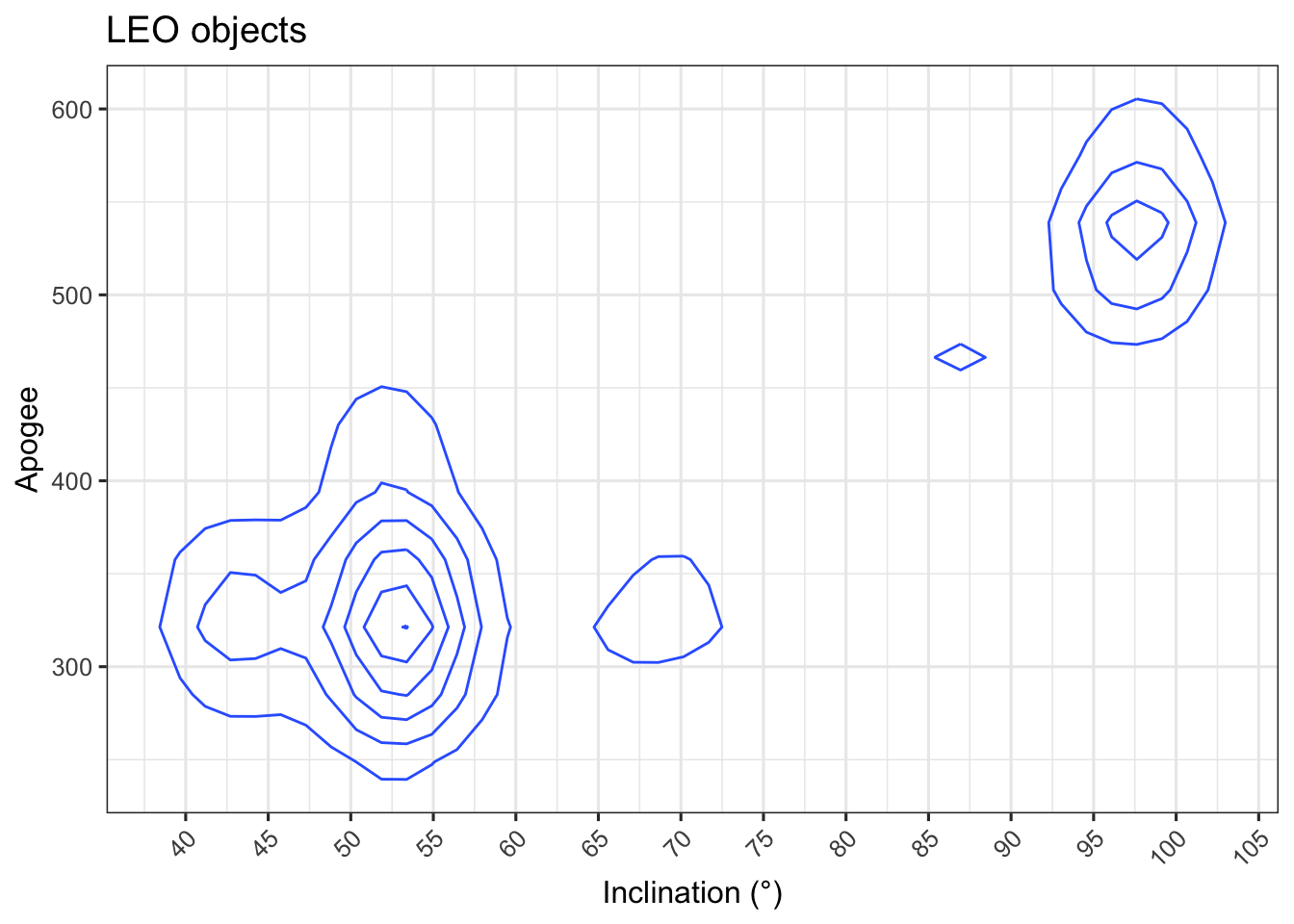
Inclination and Orbital Planes
Looking at this from a different lens of inclination vs range
leo %>%
  filter(OBJECT_TYPE == "Payload", Orbit == "LEO") %>%
  mutate(Inc_rounded = round_any(Inc,1)) %>%
  #count(Inc_rounded) %>%

  ggplot() +
  geom_density2d(aes(x=Inc_rounded, y=Apogee_rnd)) +
  labs(title = "LEO objects", y = "Apogee", x = "Inclination (°)") +
  scale_x_continuous(breaks = scales::breaks_pretty(20))
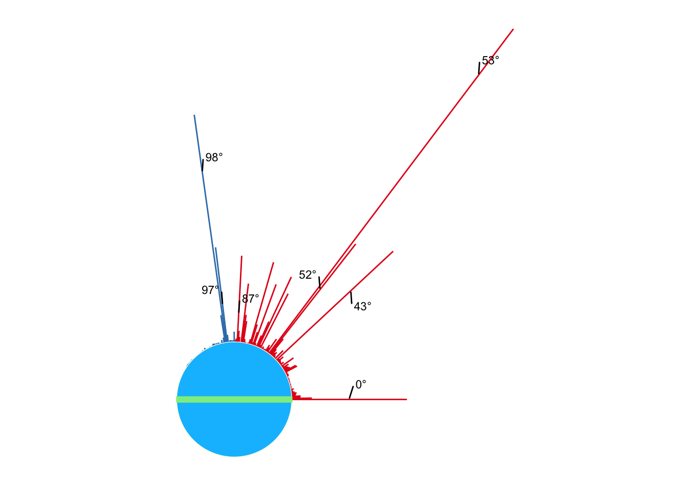
Let’s try to visualize this in relation to earth, the blue circle represents the earth and the green line, the equator; the length of the line represents the relative number of objects at a particular inclination. The label shows the inclinations rounded to the nearest integer angle in degrees.
A large proportion of the objects can be seen at 0 degree inclination, signifying an equatorial orbit, and another popular inclination is between 50 and 54 degrees. This seems to be a popular place for debris.
leo %>%
  filter(OBJECT_TYPE == "Payload") %>%
  mutate(Inc_rounded = round_any(Inc,1)) %>%
  group_by(Inc_rounded) %>%
  summarise(n = n(), .groups = "keep" ) %>% summarise(n = n, y = 500 * sin(Inc_rounded * pi/180), x = 500 * cos(Inc_rounded * pi/180), grade = if_else(Inc_rounded < 90, "prograde", "retrograde")) %>%
  ggplot() +
  #geom_histogram(aes(Inc), binwidth = 5) +
  geom_circle(aes(x0 =0, y0 = 0, r = 500), fill = "deepskyblue1", color = "ivory") +
  #geom_point(aes(x = x, y = y)) +
  geom_spoke(aes(x = x , y = y, angle = Inc_rounded * pi/180, radius = n, color = grade ), show.legend = FALSE) +
  geom_segment(aes(x = -500, y = 0, xend = 500, yend = 0), color = "lightgreen", size = 2, alpha = 0.2,) +
  coord_equal() +
  geom_text_repel(aes(x = n * cos(Inc_rounded * pi/180), y = n * sin(Inc_rounded  * pi/180), label = paste0(Inc_rounded, "°")), size = 3, nudge_x = .15, box.padding = 0.5) +
  scale_x_continuous( breaks = scales::breaks_pretty(10)) +
  scale_color_brewer(palette = "Set1") +
  theme_bw() +
  theme(axis.line = element_blank(),
        axis.text = element_blank(),
        axis.ticks = element_blank(),
        axis.title = element_blank(),
        plot.background = element_blank(),
        panel.grid.major = element_blank(),
        panel.grid.minor = element_blank(),
        panel.border = element_blank())
Conclusion
This is was quick peek into space and we looked at the characteristics of orbits and debris. Space is quite dynamic and objects move quite fast, there is a lot more to unpack and I’ll take another stab at this soon.
If there are particular things you’d like me to explore, please leave a comment and I will try to dig into those.
