Heatmaps
Heat maps are invaluable in displaying a large amount of continuous data contained in a 2d matrix. This post is meant to show a way to create a print worthy heat map in R.
Let’s start by loading the required packages.
suppressPackageStartupMessages({
  library(ggplot2)
  library(ggthemes)
  library(viridis)
  library(scales)
  library(tidyr)
})
Data
Our data is from a business that receives sales calls 24x7. Let’s read and see what the data looks like. We have observations (count of calls) for each day of the week and each hour of the day.
If there is missing data, we can use the handy complete() function from the tidy universe to fill in values. Leaving the NA values creates an ugly column in the final heat map.
vendor <- "Tours 6/1/15 - 5/30/17"
calls <- read.csv('~/data/calls.csv', header = TRUE)
calls <- complete(calls, day, call_hour,  fill = list(call = 0))
str(calls)
## tibble [168 × 3] (S3: tbl_df/tbl/data.frame)
##  $ day      : int [1:168] 0 0 0 0 0 0 0 0 0 0 ...
##  $ call_hour: int [1:168] 0 1 2 3 4 5 6 7 8 9 ...
##  $ call     : int [1:168] 300 98 74 99 340 45 91 1500 604 531 ...
We can see that the day of the week is an integer and we will convert those to a factor with the day names as levels.
Similarly, we will covert the hour of the day to a factor representation. We are only interested in business hours and this will also reorder the labels to start from 6 AM.
calls$day <- factor(calls$day, ordered=TRUE, labels=c("Sunday", "Monday", "Tuesday", "Wednesday", "Thursday", "Friday", "Saturday"))
calls$hr <- factor(format(as.POSIXct(as.character(calls$call_hour), format = "%H"), '%I %p') , levels = c("06 AM", "07 AM", "08 AM", "09 AM", "10 AM", "11 AM", "12 PM", "01 PM", "02 PM", "03 PM", "04 PM", "05 PM", "06 PM", "07 PM", "08 PM", "09 PM", "10 PM", "11 PM", "12 AM"))
str(calls)
## tibble [168 × 4] (S3: tbl_df/tbl/data.frame)
##  $ day      : Ord.factor w/ 7 levels "Sunday"<"Monday"<..: 1 1 1 1 1 1 1 1 1 1 ...
##  $ call_hour: int [1:168] 0 1 2 3 4 5 6 7 8 9 ...
##  $ call     : int [1:168] 300 98 74 99 340 45 91 1500 604 531 ...
##  $ hr       : Factor w/ 19 levels "06 AM","07 AM",..: 19 NA NA NA NA NA 1 2 3 4 ...
Finally, we will use the viridis color palette to make this easier to interpret. The theme_tufte removes the border, axis and girds to make this look a lot cleaner, and I do like the plasma palette.
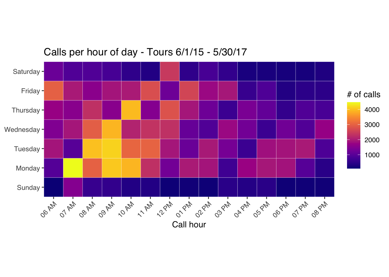
It’s clear from this heat map that Monday, Tuesday and Wednesday mornings are peak times for calls and therefore staffing can be adjusted based on these numbers.
To make it higher resolution for printing, use the ggsave() method.
  calls_business <- calls %>%
  dplyr::filter(call_hour > 4, call_hour < 21) %>%
  dplyr::filter(!is.na(hr))

  gg <- ggplot(calls_business , aes(x=hr, y=day, fill = call)) +
    geom_tile(color = "white", linewidth = 0.1) +
    scale_x_discrete(expand=c(0,0)) +
    scale_y_discrete(expand=c(0,0)) +
    scale_fill_viridis(name="# of calls", option = "plasma") +
    coord_equal() +
    labs(x="Call hour", y=NULL, title=sprintf("Calls per hour of day - %s", vendor)) +
    theme_tufte(base_family="Helvetica") +
    theme(axis.text.x = element_text(angle = 45, vjust = 1, hjust = 1))

  gg