
NPS analysis
What is net promorter score (NPS)?
Net Promoter Score or NPS is a customer loyalty metric and was developed by Fred Reichheld and it asks respondents to answer a single question.
How likely are you to recommend this product? The respondents are asked to score between 0 and 10. 10 being “most likely” to recommend and 0 being “least likely”.
An additional optional question is asked about why they picked this score and the response to that is usually a text comment. We will make an attempt to summarize the text as well.
I have NPS scores from customers of a platform that allows them to sell widgets. These scores were collected over a two year period Jun 2015 - Jun 2017, and this is an attempt to perform some exploratory data analysis and see if some more value can be extracted from this data.
Note that some of this data has been sanitized of proprietary information but the scores have been left untouched.
First, let’s load up some packages.
library(NPS)

library(ggplot2)
library(lubridate)
library(dplyr)
library(tidyr)
library(RColorBrewer)
library(ggridges)
library(reshape2)

library(tidytext)
library(wordcloud)
library(tm)
library(stringr)
library(SnowballC)

theme_set(theme_minimal())
Analyze the data.
Next load up the data and take a look.
nps <- read.csv('~/data/nps.csv', header = TRUE, quote = '"'
                , na.strings=c("", "NA", "#N/A")
                , colClasses = c("Feedback.Received"= "Date"
                               , "Comment"="character"
                               , "Survey.Sent"="Date"
                               , "TPY"="integer"
                               ))
Let’s take a look at the data. Here is some summarized information for this data
- 8423 total rows
- (TPY) range from 0 - 230,000 - TPY is a measure of the widgets sold per year on the platform by the respondent.
- Scores range from 0 - 10
- Feedback dates are from 2015-06-23 to 2017-06-05
Summarized details
##    Vertical              TPY          Non.Profit             Sent
##  Length:8423        Min.   :   -40   Length:8423        Min.   :2015-06-23
##  Class :character   1st Qu.:  1799   Class :character   1st Qu.:2016-01-17
##  Mode  :character   Median :  4816   Mode  :character   Median :2016-07-18
##                     Mean   : 10101                      Mean   :2016-07-04
##                     3rd Qu.: 10535                      3rd Qu.:2016-12-16
##                     Max.   :600000                      Max.   :2017-06-05
##                     NA's   :41                          NA's   :1632
##     Received              Score        promoter.tags      detractor.tags
##  Min.   :2015-06-23   Min.   : 0.000   Length:8423        Length:8423
##  1st Qu.:2015-12-31   1st Qu.: 7.000   Class :character   Class :character
##  Median :2016-06-22   Median : 9.000   Mode  :character   Mode  :character
##  Mean   :2016-06-17   Mean   : 7.824
##  3rd Qu.:2016-11-27   3rd Qu.:10.000
##  Max.   :2017-06-05   Max.   :10.000
##  NA's   :6824         NA's   :6824
NPS
Let’s start by getting the NPS for this data. NPS scores can vary from -100 (all detractors) to 100 (all promoters). Note that the while NPS is expressed as a number between -100 and 100, the CRAN NPS package returns results from [-1,1]. All plots use the returned results and ideally should be multiplied by 100 and rounded. Before we can calculate that number we will need to ensure that our data actually has scores.
Let’s drop all rows that don’t have Scores.
nps <- nps %>%
    drop_na(Score)
That leaves us with 1599 rows.
Let’s enrich this data just a little bit. We’ll add a column for the day of the week, month, year of received date and the days to respond. We have also added categories based on the Score. Respondents who score from 0 through 6 are considered detractors of the service, 7 - 8 are passives and 9 and 10s are considered promorters.
nps$year <- as.factor(year(nps$Received))
nps$month <- cut(nps$Received, breaks = "month")
nps$days <- nps$Received - nps$Sent
nps$weekday <- weekdays(nps$Received)
nps$weekday <- factor(nps$weekday, levels = c("Sunday", "Monday", "Tuesday", "Wednesday",
    "Thursday", "Friday", "Saturday"))
nps$cat <- cut(nps$Score, breaks = c(-1, 6, 8, 10), labels = c("Detractor", "Passive",
    "Promoter"))
Overall NPS Score
What’s the overall NPS score?
nps(nps$Score,  breaks = list(0:6, 7:8, 9:10))
## [1] 0.2826767
Yearly changes
Has there been any change in the score over time?
yearly <- aggregate(nps$Score, list(nps$year), FUN = nps, nps$Score)

ggplot(yearly) +
  geom_col(aes(x=as.factor(Group.1), y=x, fill=as.factor(Group.1)), width=0.5) +
  xlab("Year") +
  ylab("NPS") +
  geom_text(aes(x=as.factor(Group.1), y=x, label=round(x,2)),  vjust = 1, hjust = 1)  +
  coord_flip()  +
  scale_fill_brewer("Year", palette = "Set1")
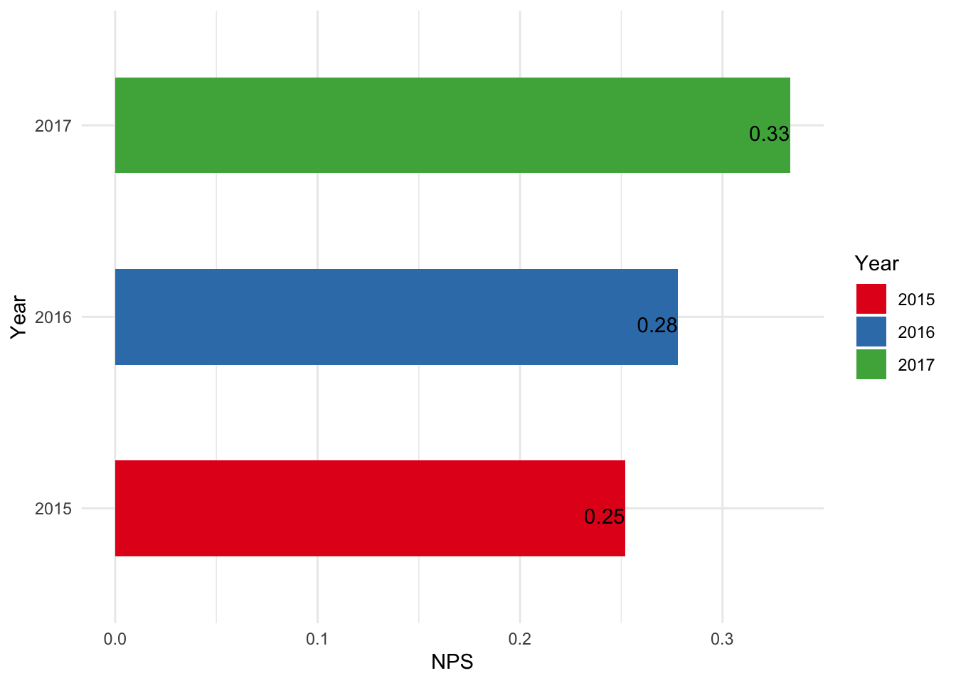
Looks like there has been a consistent improvement over the years.
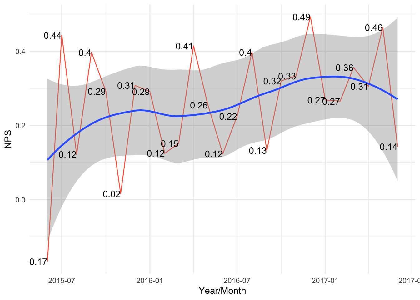
Monthly changes
Looking at the score monthly over time we can see that there is an upward trend but the growth is not consistent.
np <- aggregate(nps$Score, list(nps$month), FUN = nps, nps$Score)

ggplot(np, aes(x=as.Date( Group.1), y=x)) +
  geom_line(color = "tomato") +
  geom_smooth(method = "loess") +
  xlab("Year/Month") +
  ylab("NPS") +
  geom_text(aes( y=x, label=round(x,2)), position = position_dodge(width = 1), vjust = 0.5, hjust=1)  +
  theme_minimal()
## `geom_smooth()` using formula = 'y ~ x'
Exploring some other dimensions
Are there other dimensions that affect NPS?
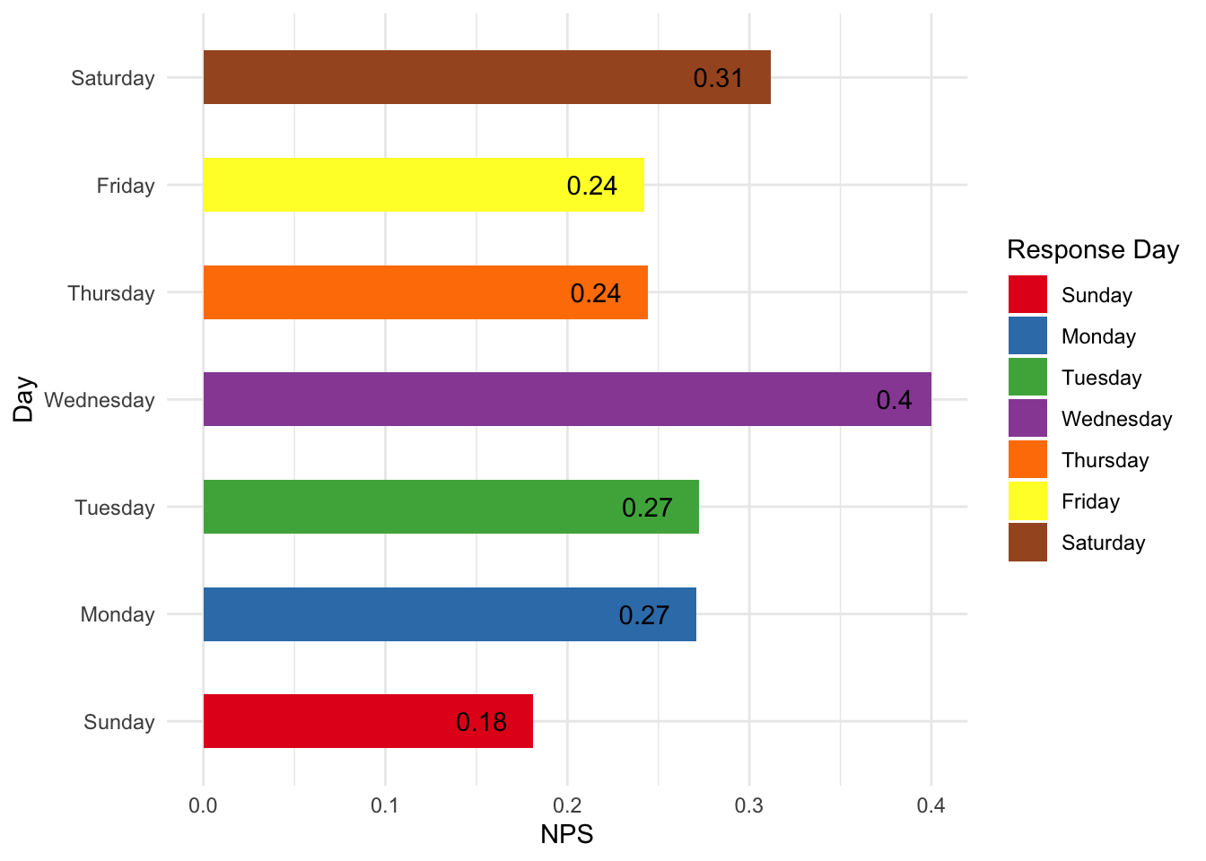
Day of the week
Does the day of the week affect the score?
Looks like responses provided on Wednesday have a higher score. Might be something worth exploring to see if this is just random chance or if this is something real.
daily <- aggregate(nps$Score, list(nps$weekday), FUN = nps, nps$Score)

daily$Group.1 <- factor(daily$Group.1, levels = c("Sunday", "Monday","Tuesday", "Wednesday", "Thursday", "Friday", "Saturday"))

ggplot(daily) +
  geom_col(aes(x=as.factor(Group.1), y=x, fill=as.factor(Group.1)), width=0.5) +
  xlab("Day") +
  ylab("NPS") +
  geom_text(aes(x=as.factor(Group.1), y=x, label=round(x,2)),  vjust = 0.5, hjust = 1.5)  +
  coord_flip()  +
  scale_fill_brewer("Response Day", palette = "Set1")
One more view of the scores by day; do respondents leave higher score on some days?
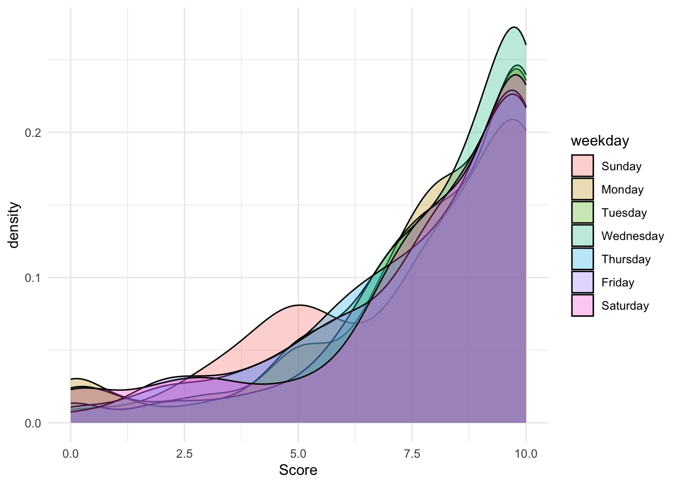
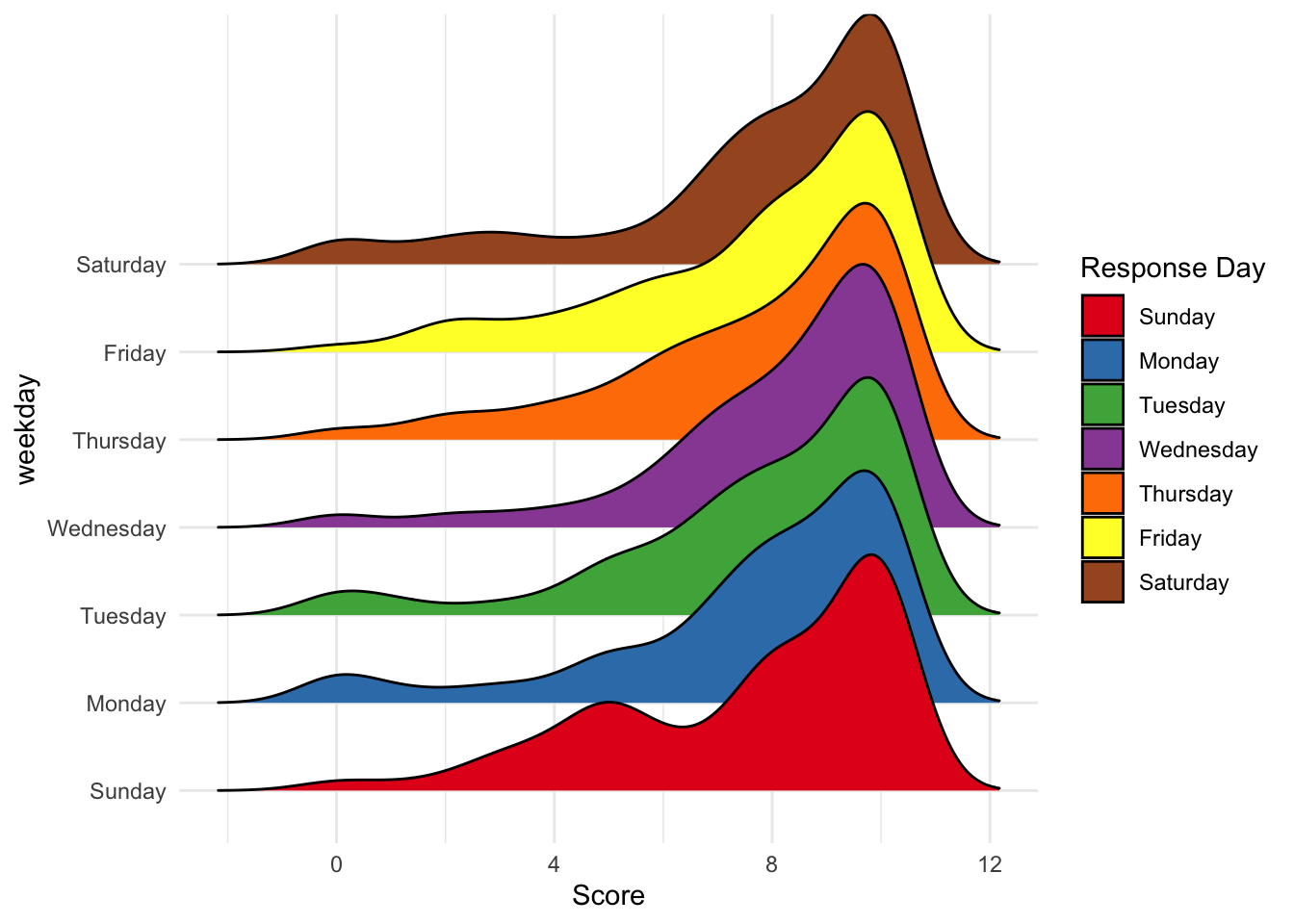
Day of Week vs Scores
This plot shows the kernel density of the scores (0-10) received by day. It seems that respondents who leave scores on Wednesday seem to provide more 10s compared to Sunday. In fact, there seems to be a bi-modal distribution on Sunday with 5s and 10s.
ggplot(nps) +
  geom_density(aes( x = Score,  group = weekday, fill = weekday), alpha = 0.3)
Here is a ridges plot for the score density by day. It’s harder to compare the relative heights of the score density compared to the density plot above. The bi-modal distribution of scores on Sunday is, however, quite clear here.
ggplot(nps) +
  geom_density_ridges(aes( x = Score, y = weekday, fill = weekday), scale = 3) +
  scale_fill_brewer("Response Day", palette = "Set1")
## Picking joint bandwidth of 0.724
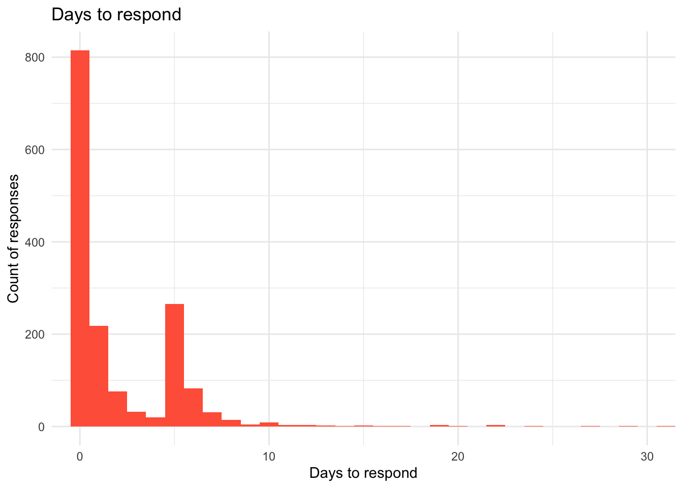
Time to respond.
How long are respondents taking to respond?
It seems like most responses are received on the same day as the survey was sent. There is a peak on the 5th day as well. Given the fact that responses on Wednesday seems to generate higher scores, if requests are sent on Wednesday, it may skew towards more positive scores.
ggplot(nps) +
  geom_histogram(aes(as.numeric( days)), binwidth = 1, fill = "tomato") + labs(title = "Days to respond", x = "Days to respond", y = "Count of responses")  +
  coord_cartesian(xlim = c(0,30))
Scores over the years
How have the scores changed over time?
Has the median score shifted over the years?
ggplot(subset(nps, !is.na(year)), aes(y=Score, x=year)) +
  geom_boxplot() +
  geom_point( position = "jitter", alpha = 0.4, aes(color=as.factor(Score))) +
  guides(color=FALSE)
## Warning: The `<scale>` argument of `guides()` cannot be `FALSE`. Use "none" instead as
## of ggplot2 3.3.4.
## This warning is displayed once every 8 hours.
## Call `lifecycle::last_lifecycle_warnings()` to see where this warning was
## generated.

We can see that 2017 seems to show a higher median score, but how much higher? This plot shows the kernel density of the scores.
ggplot(nps) + geom_density(aes(x=Score, fill = year, binwidth =1 ), alpha = 0.5) + coord_cartesian(xlim = c(0,10)) +
   scale_fill_brewer("Year", palette = "Set1")
## Warning in geom_density(aes(x = Score, fill = year, binwidth = 1), alpha =
## 0.5): Ignoring unknown aesthetics: binwidth

To see a percentage distribution, we can plot the cumulative frequency distribution of the Score categories grouped by year. The plot shows what percentage of Scores fall into which category groups.
ggplot(nps) +
  stat_ecdf(aes(x=cat, group = year, colour = year))

The table below shows the exact percentage of category groups by year. One can see that while the percentage of detractors has remained somewhat static over the years, some of the passive group has shifted to being promorters.
nps %>%
  group_by(year, cat) %>%
  summarise(cat_count = length(cat)) %>% mutate(pct = round((cat_count/sum(cat_count)*100),2))
## `summarise()` has grouped output by 'year'. You can override using the
## `.groups` argument.
## # A tibble: 9 × 4
## # Groups:   year [3]
##   year  cat       cat_count   pct
##   <fct> <fct>         <int> <dbl>
## 1 2015  Detractor        94  23.4
## 2 2015  Passive         112  27.9
## 3 2015  Promoter        195  48.6
## 4 2016  Detractor       196  22.4
## 5 2016  Passive         239  27.4
## 6 2016  Promoter        439  50.2
## 7 2017  Detractor        72  22.2
## 8 2017  Passive          72  22.2
## 9 2017  Promoter        180  55.6
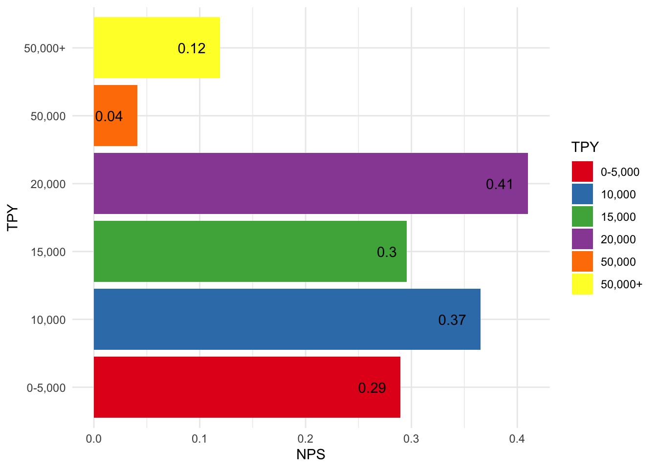
TPY
Recall that TPY is a measure of the widgets sold on the platform. Does the TPY affect score? We are going to create some groups based on the TPY number. It seems clear that the customers at 20,000 and below TPY levels are happier than the larger sized customers.
# Add TPY levels
nps$tp_level <- cut(nps$TPY, breaks=c(-1,5000, 10000, 15000, 20000, 50000, +Inf), labels = c("0-5,000", "10,000", "15,000", "20,000", "50,000", "50,000+"))


tix <- aggregate(nps$Score, list(nps$tp_level), FUN = nps, nps$Score)

ggplot(tix) +
  geom_col(aes(x=as.factor(Group.1), y=x, fill=as.factor(Group.1))) +
  xlab("TPY") +
  ylab("NPS") +
  geom_text(aes(x=as.factor(Group.1), y=x, label=round(x,2)), position = position_dodge(width = 1), hjust=1.5) +
  scale_fill_brewer("TPY", palette = "Set1") +
  coord_flip()
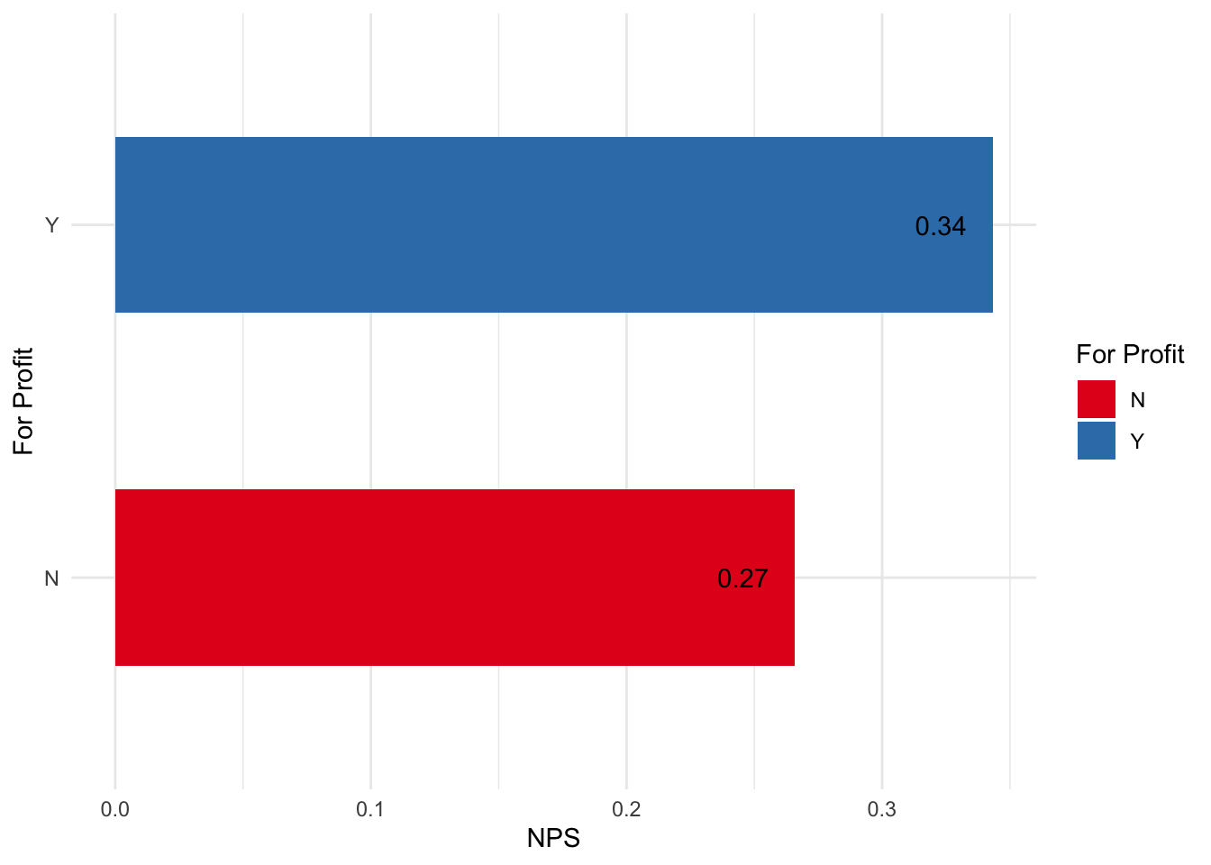
For profit vs non-profit customers
There is a flag that shows if the respondent is a non-profit. It seems that for profit customers have higher satisfaction.
profit <- nps %>%
  filter(!is.na(Non.Profit)) %>%
  group_by(Non.Profit) %>%
  summarise(nps = nps(Score))

ggplot(profit) +
  geom_col(aes(x=Non.Profit, y=nps, fill=Non.Profit), width=0.5) +
  xlab("For Profit") +
  ylab("NPS") +
  geom_text(aes(x=Non.Profit, y=nps, label=round(nps,2)), position = position_dodge(width = 1), hjust=1.5) +
  scale_fill_brewer("For Profit", palette = "Set1") +
  coord_flip()
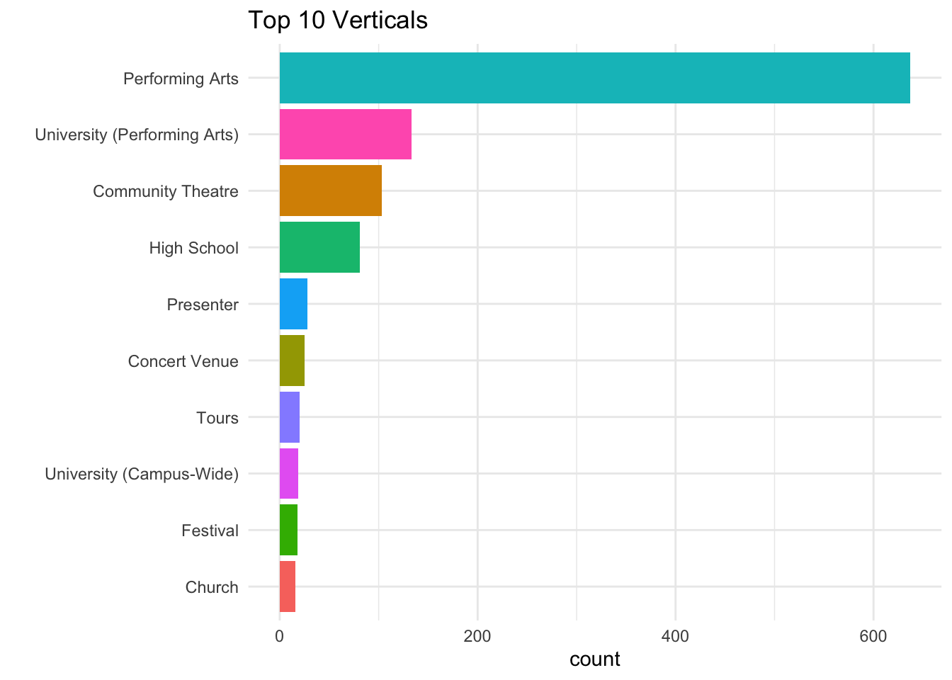
Verticals
The data has a column that shows the vertical of the respondent. This is an indicator of the category of widget being sold by the platform.
The PrA vertical has the largest number of respondents.
vertical <- nps %>%
  filter(!is.na(Vertical)) %>%
  group_by(Vertical) %>%
  tally() %>%
  top_n(10)
## Selecting by n

ggplot(vertical, aes(x=reorder(Vertical, n), y = n)) +
  geom_col(aes(fill = Vertical))  +
  guides(fill=FALSE) +
  ggtitle("Top 10 Verticals") +
  xlab("") +ylab("count") +
  coord_flip()
Score by Vertical
What’s the NPS score by Vertical? There seems to be a large variation of NPS by Vertical. Not sure if some connection should be derived from this. This may be something to explore further.
vert_score <- nps  %>%
  group_by(Vertical) %>%
  summarise(nps = nps(Score))

ggplot(vert_score) +
  geom_col(aes(x=reorder(Vertical, nps), y=nps, fill=Vertical)) +
  guides(fill=FALSE) +
  coord_flip() +
  scale_fill_discrete(name = "Vertical") +
  ylab("NPS") + xlab("Vertical") +
  geom_text(aes(x=Vertical, y=nps, label=round(nps,2)), position = position_dodge(width = 1),vjust = 0.5, hjust=1)

As evident from this that there are several dimensions to guide us about the respondents and what they like about the platform. The next steps here would be to try and perform classification and machine learning techniques to examine this data further.
Before we get into ML, let’s perform some more exploration on the text included in the data.
Text Analysis
This part will try to analyze the sentiment of the comments to perhaps try and understand what the detractors don’t like and what the promoters like. To do this we will try and perform the following tasks.
Introduction
- Tokenize the text comments. We will explore both with word and sentence level tokens.
- Perform sentiment analysis using three different sentiment lexicons. These are pre-scored dictionaries that have sentiment scores already assigned at word levels.
- Look at term document frequencies
- Try and explore n-grams to see relationship between words.
- Finally, try out the word2vec neural network to explore the corpus.
Tokenization
We will keep the categories in place to see how the sentiment correlates to the scores. Let’s see how many comments we have from each category.
comments <- nps %>%
  filter(!is.na(Comment)) %>%
  select(cat, Comment) %>%
  group_by(row_number(), cat)

comments <- comments %>% ungroup()
Next we will use unnest_tokens from the tidytext package to tokenize the words while retaining the corresponding categories. We end up with about 24,000 words.
nps_words <- comments %>% unnest_tokens(word, Comment)
nps_words
## # A tibble: 24,460 × 3
##    cat      `row_number()` word
##    <fct>             <int> <chr>
##  1 Promoter              1 customer
##  2 Promoter              1 service
##  3 Promoter              2 intuitive
##  4 Promoter              2 program
##  5 Promoter              2 and
##  6 Promoter              2 accessible
##  7 Promoter              2 support
##  8 Promoter              3 easy
##  9 Promoter              3 to
## 10 Promoter              3 use
## # ℹ 24,450 more rows
Our next step is to remove some common words that are not useful for analysis. These include pronouns, articles and other common words. The tidytext package already includes a wide range of these in the stop_words dataset.
We are left with about 2243 unique words with
nps_words <-  nps_words %>% anti_join(stop_words, by = c('word'))
nps_words %>% count(word, sort = TRUE)
## # A tibble: 2,244 × 2
##    word         n
##    <chr>    <int>
##  1 platform   353
##  2 service    280
##  3 customer   229
##  4 system     191
##  5 support    187
##  6 easy       155
##  7 ease       142
##  8 ticket      91
##  9 friendly    89
## 10 user        84
## # ℹ 2,234 more rows
Sentiment Analysis
We will be using three different sentiment dictionaries to test out the sentiments for each comment.
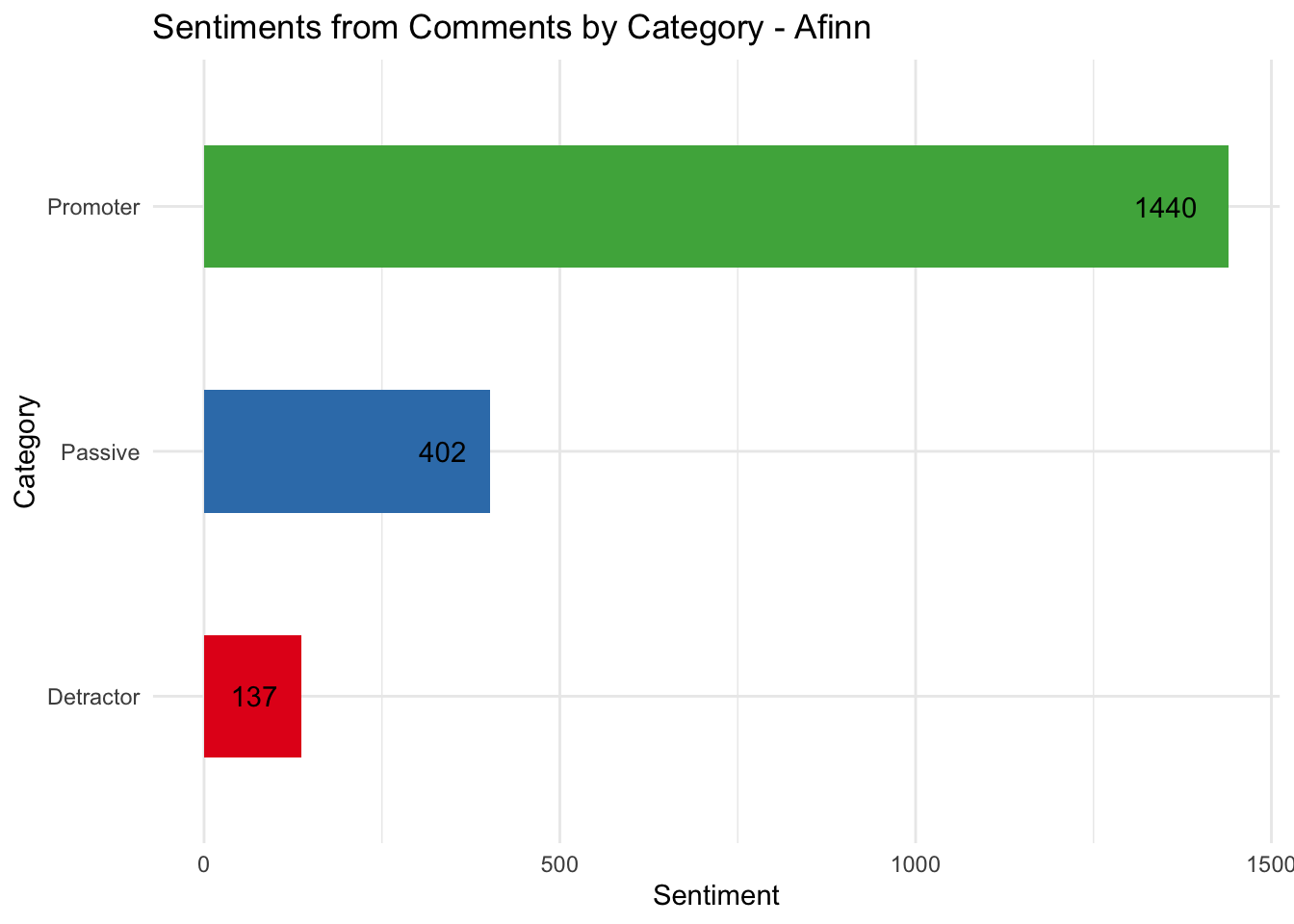
The plot below shows the sentiments grouped by the category using the Afinn dictionary. The Afinn dictionary assigns a score from -5 to 5 with -5 being negative words and 5 being positive. It’s clear that the detractor comments are less positive than the promoters.
nps_words %>% inner_join(get_sentiments("afinn"), by = c('word')) %>%
  group_by(cat) %>%
  summarise(sentiment = sum(value)) %>%
  ggplot(aes(x=cat, y = sentiment, fill = cat)) +
  geom_col(width = 0.5) +
  coord_flip() +
  geom_text(aes(x=cat, y=sentiment, label=sentiment), position = position_dodge(width = 1), hjust=1.5) +
  scale_fill_brewer(palette = "Set1") +
  guides(fill=FALSE) +
  labs(title = "Sentiments from Comments by Category - Afinn", x = "Category", y = "Sentiment")
Let’s try another lexicon. This one is called Bing and was produced by Bing Liu et al. This classifies words with a label signifying positive or negative. Here is a sample of words from this lexicon.
get_sentiments("bing")
## # A tibble: 6,786 × 2
##    word        sentiment
##    <chr>       <chr>
##  1 2-faces     negative
##  2 abnormal    negative
##  3 abolish     negative
##  4 abominable  negative
##  5 abominably  negative
##  6 abominate   negative
##  7 abomination negative
##  8 abort       negative
##  9 aborted     negative
## 10 aborts      negative
## # ℹ 6,776 more rows
Next, let’s look at the sentiments for each category using the Bing dictionary.
nps_words %>%
  inner_join(get_sentiments("bing"), by = c('word')) %>%
  count(cat, sentiment) %>%
  spread(sentiment, n, fill = 0) %>%
  mutate(sentiment = positive - negative) %>%
ggplot(aes(x=cat, y = sentiment, fill = cat)) +
  geom_col(width = 0.5) +
  coord_flip() +
  geom_text(aes(x=cat, y=sentiment, label=sentiment), position = position_dodge(width = 1), hjust=1) +
  scale_fill_brewer(palette = "Set1") +
  guides(fill=FALSE) +
  labs(title = "Sentiments from Comments by Category - Bing", x = "Category", y = "Sentiment")
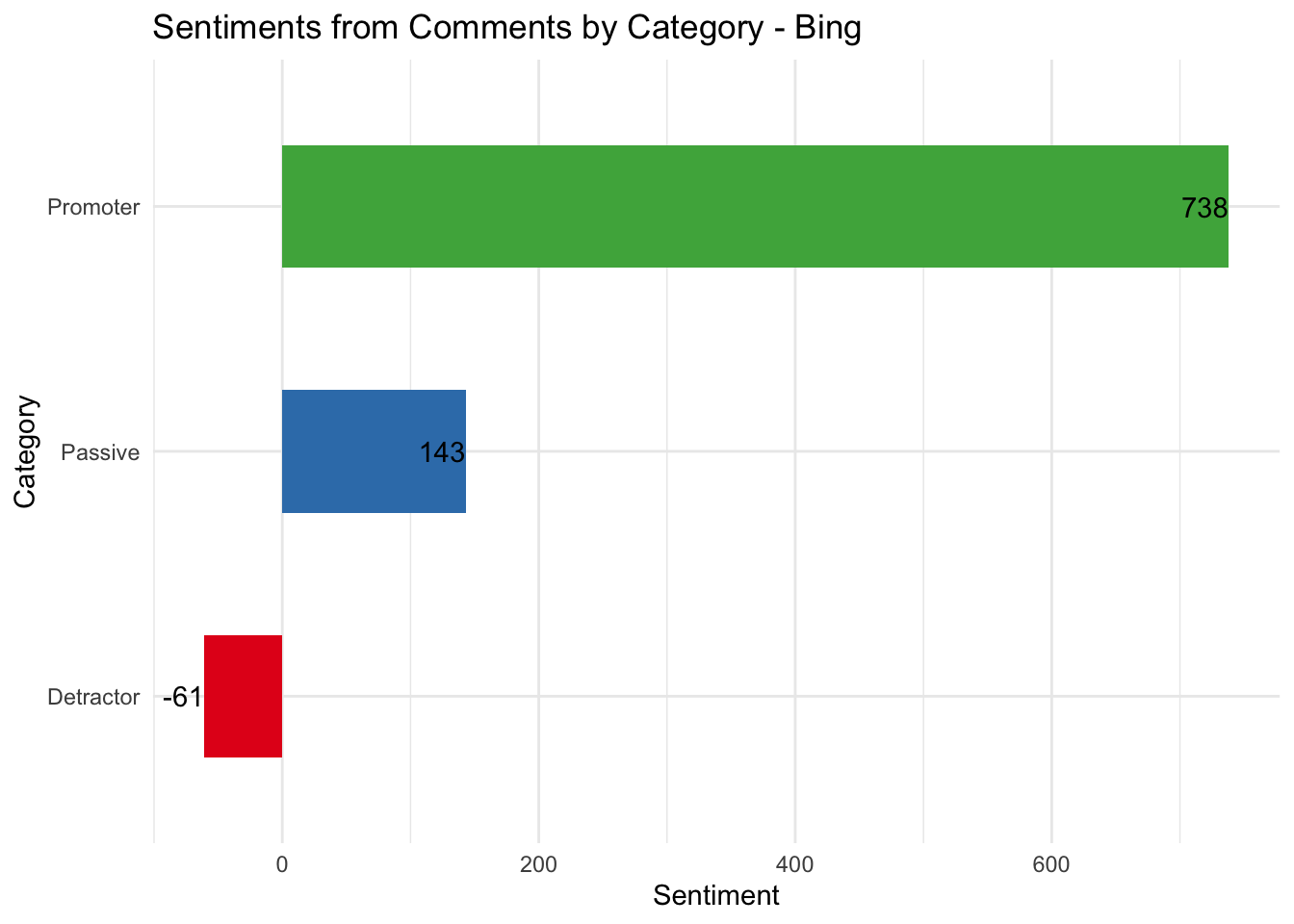
While both lexicons show the same relative trends and proportions, the absolute numbers vary significantly. It might be worth taking a quick look at the words that are contributing to each sentiment.
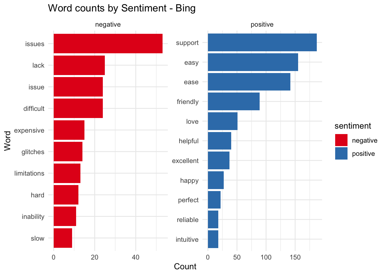
This can be achieved by plotting the positive and negative words from the previous set. It’s clear from this list that if we had used some kind of stemmer before creating this list, some of the words with the same roots would have been eliminated, these are words like ease and easy and issues and issue.
nps_words %>%
  inner_join(get_sentiments("bing"), by = c('word')) %>%
  count(word, sentiment) %>%
  group_by(sentiment) %>%
  top_n(10) %>%
  ungroup() %>%
  ggplot(aes(x=reorder(word, n), y = n, fill = sentiment)) +
  geom_col() +
  facet_wrap( ~ sentiment, scales = "free") + coord_flip() +
  scale_fill_brewer(palette = "Set1") +
  labs(title = "Word counts by Sentiment - Bing", x = "Word", y = "Count")
## Selecting by n
Before we run the stemmer, let’s examine the top sentiment contributor words by category as well to illustrate one more potential gotcha. A word like helpful in the detractors column could, depending on the context, have a negative connotation if preceded by the word not. In fact unigrams (word tokens) will have this issue with negation in most cases.
nps_words %>%
  inner_join(get_sentiments("bing"), by = c('word')) %>%
  count(cat, word, sentiment) %>%
  group_by(cat, sentiment) %>%
  top_n(7) %>%
  ungroup() %>%
  ggplot(aes(x=reorder(word, n), y = n, fill = sentiment)) +
  geom_col() +
  coord_flip() +
  facet_wrap( ~cat, scales = "free")  +
  scale_fill_brewer(palette = "Set1") +
  labs(title = "Word counts by Sentiment by Category - Bing", x = "Words", y = "Count")
## Selecting by n

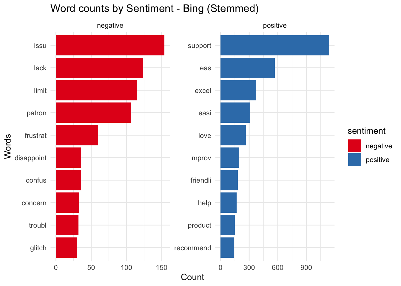
Stemming
We ran the Porter stemmer from the SnowballC package on both the comments and the sentiment lexicon to enable us to join on the same words. The words issue and issues have now been stemmed to the root word issu.
nps_words %>%
  mutate(word = wordStem(word)) %>%
  inner_join(get_sentiments("bing") %>% mutate(word = wordStem(word)), by = c('word')) %>%
  count(word, sentiment) %>%
  group_by(sentiment) %>%
  top_n(10) %>%
  ungroup() %>%
  ggplot(aes(x=reorder(word, n), y = n, fill = sentiment)) +
  geom_col() +
  facet_wrap( ~ sentiment, scales = "free") + coord_flip() +
  scale_fill_brewer(palette = "Set1") +
  labs(title = "Word counts by Sentiment - Bing (Stemmed)", x = "Words", y = "Count")
## Selecting by n
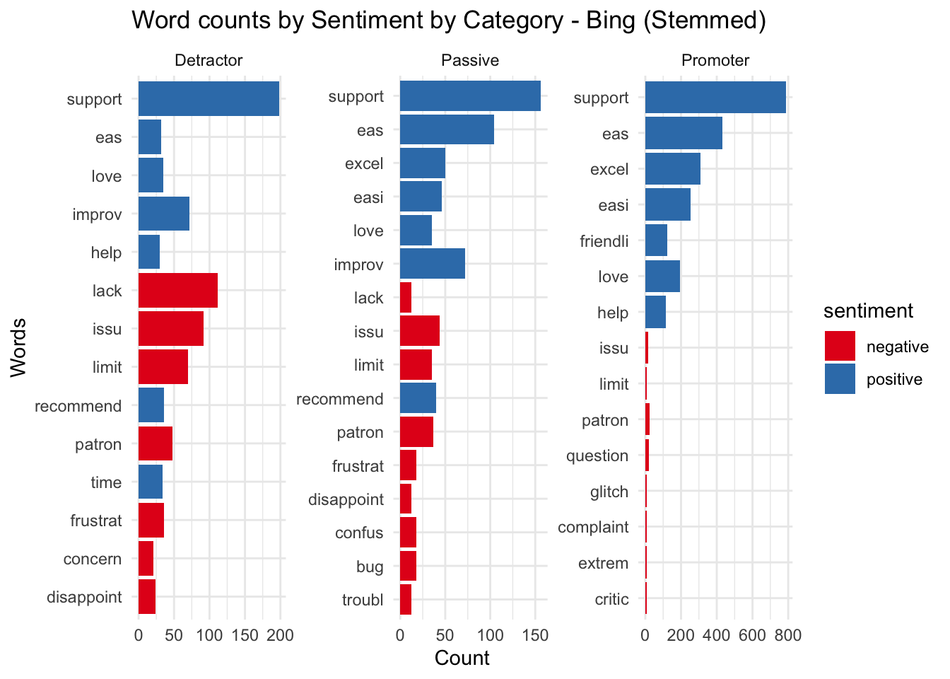
Let’s try to group by catgory with stemming. It’s clear that there is a larger proportion of negative sentiment words in the detractor comments and a smaller proportion for promorters. This line of exploration has confirmed our belief that detractors are leaving negative comments and promorters are generally upbeat and positive.
nps_words %>%
  mutate(word = wordStem(word)) %>%
  inner_join(get_sentiments("bing") %>% mutate(word = wordStem(word)), by = c('word')) %>%
  count(cat, word, sentiment) %>%
  group_by(cat, sentiment) %>%
  top_n(7) %>%
  ungroup() %>%
  ggplot(aes(x=reorder(word, n), y = n, fill = sentiment)) +
  geom_col() +
  coord_flip() +
  facet_wrap( ~cat, scales = "free")  +
  scale_fill_brewer(palette = "Set1") +
  labs(title = "Word counts by Sentiment by Category - Bing (Stemmed)", x = "Words", y = "Count")
## Warning in inner_join(., get_sentiments("bing") %>% mutate(word = wordStem(word)), : Detected an unexpected many-to-many relationship between `x` and `y`.
## ℹ Row 5 of `x` matches multiple rows in `y`.
## ℹ Row 5908 of `y` matches multiple rows in `x`.
## ℹ If a many-to-many relationship is expected, set `relationship =
##   "many-to-many"` to silence this warning.
## Selecting by n
ngrams
Ngrams are series of words in sequence; bigrams are two words together and trigrams are three. Lets take a quick look at the bigrams in the comments to see what those phrases are.
comments %>%
unnest_tokens(ngram, Comment, token = "ngrams", n = 2) %>%
count(ngram, sort = TRUE)
## # A tibble: 13,715 × 2
##    ngram                n
##    <chr>            <int>
##  1 customer service   165
##  2 ease of            134
##  3 to use             122
##  4 easy to            113
##  5 of use             110
##  6 of the              75
##  7 i have              71
##  8 the system          71
##  9 user friendly       69
## 10 it is               67
## # ℹ 13,705 more rows
In this case we have not removed the stop words, let’s try looking at the trigrams to see if those provide more meaning. These are phrases that have the word not prefixed.
comments %>% unnest_tokens(ngram, Comment, token = "ngrams", n = 3) %>% count(ngram, sort = TRUE) %>% filter(str_detect(ngram, '^not '))
## # A tibble: 182 × 2
##    ngram                      n
##    <chr>                  <int>
##  1 not a 10                   3
##  2 not been fixed             3
##  3 not being able             3
##  4 not able to                2
##  5 not as flexible            2
##  6 not been as                2
##  7 not flexible enough        2
##  8 not give a                 2
##  9 not handle the             2
## 10 not recommend platform     2
## # ℹ 172 more rows
As a final step in this exploration, we will create a comparison word cloud
par(mar=rep(0, 4))
plot.new()

nps_words %>%
  inner_join(get_sentiments("bing"), by = c('word')) %>%
  count(word, sentiment, sort = TRUE) %>%
    acast(word ~ sentiment, value.var = "n", fill = 0) %>%
  comparison.cloud( random.order=FALSE,title.size=1.5, max.words=150, colors = brewer.pal(8, "Set1"))

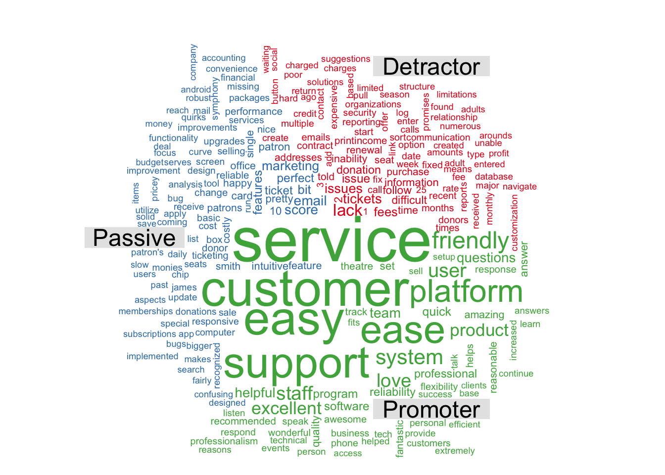
And another one grouped by the categories.
par(mar=rep(0, 4))
plot.new()

nps_words %>%
  count(word, cat, sort = TRUE) %>%
  acast(word ~ cat, value.var = "n", fill = 0) %>%
  comparison.cloud( random.order=FALSE,title.size=1.5, max.words=250, colors = brewer.pal(8, "Set1"))
Ranking and tf-idf
A central question in text analysis deals with what the text is about, to explore that, we will try to do different things;
- Try and rank the terms using tf-idf (term frequency - inverse document frequency)
- Try to extract the topic or subject of the text using LDA (Latent Dirichlet allocation )
The statsitic tf-idf measures how important a term is to a document in a collection of documents. So in our context we are trying to see if a term/word has special meaning in one respondent’s comments in relation to all other comments.
We will use the bind_tf_idf function to extract the statistic and sort based on the relative importance.
nps_tf_idf <- comments %>%
  unnest_tokens(word,Comment) %>%
  count(cat, word, sort = TRUE) %>%
  ungroup() %>%
  bind_tf_idf(word, cat, n) %>%
  arrange(desc(tf_idf))

nps_tf_idf
## # A tibble: 4,485 × 6
##    cat       word                n       tf   idf   tf_idf
##    <fct>     <chr>           <int>    <dbl> <dbl>    <dbl>
##  1 Detractor lack               24 0.00258  0.405 0.00105
##  2 Promoter  reasonable          7 0.000843 1.10  0.000926
##  3 Passive   smith               5 0.000730 1.10  0.000801
##  4 Passive   under               5 0.000730 1.10  0.000801
##  5 Detractor contract            6 0.000645 1.10  0.000708
##  6 Detractor income              6 0.000645 1.10  0.000708
##  7 Detractor won't               6 0.000645 1.10  0.000708
##  8 Promoter  professionalism     5 0.000602 1.10  0.000662
##  9 Promoter  respond             5 0.000602 1.10  0.000662
## 10 Passive   part                4 0.000584 1.10  0.000641
## # ℹ 4,475 more rows
Let’s plot this next by category.
nps_tf_idf %>%
  group_by(cat) %>%
  top_n(15) %>%
  ungroup() %>%
  ggplot(aes(reorder(as.factor(word), tf_idf), tf_idf, fill = cat )) +
  geom_col(show.legend = FALSE) +
  coord_flip() +
  labs(title = "TF-IDF by Category", x = "words") +
  scale_fill_brewer(palette = "Set1") +
  facet_wrap(~cat, scales = "free")
## Selecting by tf_idf
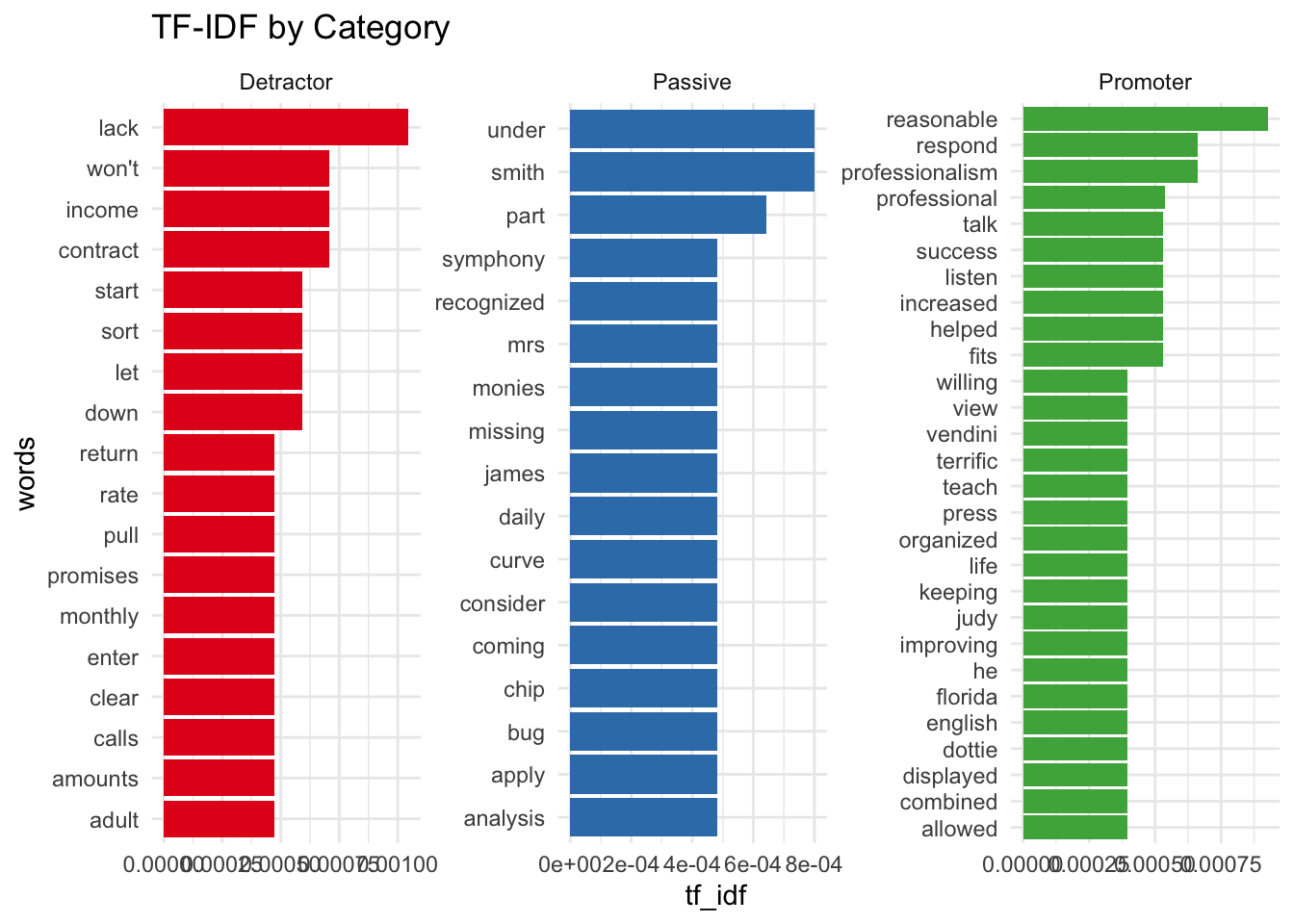
This shows some proper nouns and pronouns, which is to be expected as only few comments would have those relative to the others.
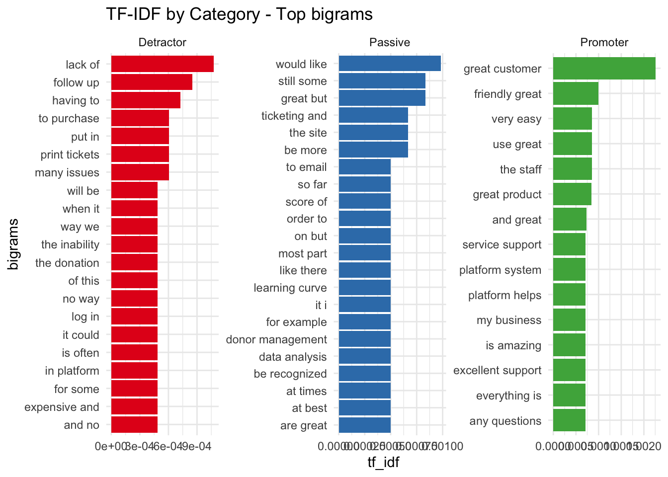
TF-IDF with bigrams
As a variation on this - let’s repeat this with bigrams to see if certain phrases are more important.
nps_tf_idf_bigram <- comments %>%
  unnest_tokens(ngram,Comment, token = "ngrams", n = 2) %>%
  count(cat, ngram, sort = TRUE) %>%
  ungroup() %>%
  bind_tf_idf(ngram, cat, n) %>%
  arrange(desc(tf_idf))

nps_tf_idf_bigram
## # A tibble: 16,174 × 6
##    cat       ngram              n       tf   idf   tf_idf
##    <fct>     <chr>          <int>    <dbl> <dbl>    <dbl>
##  1 Promoter  great customer    43 0.00557  0.405 0.00226
##  2 Detractor lack of           24 0.00265  0.405 0.00107
##  3 Promoter  friendly great     7 0.000907 1.10  0.000997
##  4 Passive   would like        16 0.00243  0.405 0.000985
##  5 Promoter  the staff          6 0.000778 1.10  0.000854
##  6 Promoter  use great          6 0.000778 1.10  0.000854
##  7 Promoter  very easy          6 0.000778 1.10  0.000854
##  8 Detractor follow up          7 0.000773 1.10  0.000849
##  9 Promoter  great product     16 0.00207  0.405 0.000841
## 10 Passive   great but          5 0.000759 1.10  0.000834
## # ℹ 16,164 more rows
Break this up by category.
nps_tf_idf_bigram %>% group_by(cat) %>%
  top_n(15) %>%
  ungroup() %>%
  ggplot(aes(reorder(as.factor(ngram), tf_idf), tf_idf, fill = cat )) +
  geom_col(show.legend = FALSE) +
  coord_flip() +
  labs(title = "TF-IDF by Category - Top bigrams", x = "bigrams") +
  scale_fill_brewer(palette = "Set1") +
  facet_wrap(~cat, scales = "free", ncol = 3)
## Selecting by tf_idf
Conclusion
Here are a few clear takeaways from this analysis
- Passive respondents from prior years have become Promorters.
- Respondents seem to provide higher Scores on Wednesday.
- Customer Service has a huge positve impact on the scores.
- Response rates are quite low - 19 percent
- Product is generally user friendly.
- Low and mid segment users are happier than higher sales respondents.
